Wineries typically have an old-world, romantic feel, but once you see the stunning details of this gorgeous wedding at HammerSky Vineyards, you’ll be convinced that a winery can totally pull off a modern vibe.
A MODERN INVITATION
A MODERN MONOGRAM
It doesn’t matter what kind of wedding you’re having, your invitations are going to set the tone from the second they hit your guests’ mailboxes.
To make sure guests knew this would be a fun, but modern affair, we started with a bold color palette. Shades of blue, yellow, and salmon gave a summery feel, while a modern monogram kept the invitations feeling “grown up”.
WAX SEALS and MODERN SHAPES
Color was not lacking in this wedding and we counterbalanced all the blue with pops of salmon pink in the envelope and wax seal. A chintzy floral envelope liner brought a feminine touch without being overly romantic.
Especially unique was the layered diamond invitation, designed carefully to display information along the visible edges so guests don’t miss a thing!
MODERN CALLIGRAPHY
Calligraphy often has a fussy, romantic feel – unless it’s done by the right hands! We pride ourselves on our take on modern calligraphy. Our modern style is a little bit fun, a little bit sassy, NEVER stuffy, but always classy. (Was that a haiku?)
THE BIG DAY
WAX SEAL PLACE CARDS
We brought some cohesiveness to the day with a wax seal place card, featuring the same salmon-colored hydrangea seal that held the invitation together. And what is a place card without our modern calligraphy? Nothing special. So of course we used some shimmery salmon ink to add a pop of pink to the tablescape.
LAYERED TASSEL MENU
We loved the layered look of the invitation so much that we just had to carry it through to the menu too! Shades of blue and yellow, along with some modern typography, gave this menu a fun and interactive feel. And, hello, can we talk about that layered tassel?!? You can guarantee guests took that menu home, because it was just too good to leave behind!
EDIBLE TABLESCAPE
An edible tablescape?! Sign me up! This gorgeous centerpiece featured beautiful blooms AND delicious treats from the garden in all the stunning hues of the couple’s palette.
Let’s face it. Taking pictures of pieces of paper just isn’t the same as capturing an adoring couple on the biggest day of their life.
But there is a difference between good stationery photography and GREAT stationery photography – and whether you’re a professional wedding photographer or a stationer looking to expand your image portfolio, I’m here to let you in on all of my secret tips for achieving swoon-worthy photos of stationery!
o1 – Choosing a Surface
This should be obvious, but I’ll go there anyway – ya need something to put your stationery ON before you photograph it. Now, what that something is…well that’s up to you.
Here are a few helpful hints when selecting a backdrop for photographing stationery:
Choose a neutral color that compliments the colors of the invitation. Bright & bold is OK as long as it still allows the invitation to shine!
Avoid super-busy patterns, they just eat up those invitations and the photo becomes all about the pattern.
Texture is always welcome, but make sure it doesn’t compete with the invitation vibe. A busy texture plus a busy invitation only make for stressed out eyeballs.
It should be relatively flat – iron out any wrinkles and make sure you have a clear, well-lit space to lay it on
Avoid using shiny materials, as they also compete with the invitation for your eye’s attention.
You’ll want something about 2′ x 3′ to give your invitations enough room to breathe. And here are a few of my favorite items to use as backdrops for photographing my stationery:
White poster board (the not shiny side works best)
Upholstery fabric – it’s usually fairly sturdy so I don’t have to iron it too much and comes in mild colors/patterns/textures that compliment a wide range of invitation color palettes
Velvet, suede, & velour – have a rich feel, also don’t require a ton of ironing
Muslin – very inexpensive and has a linen look, it will force you to become best friends with your iron
Vinyl photo backdrops – you can find them in a variety of colors and prints (marble is my favorite) on Amazon
Styling mats – fabric mats that you can just roll out as needed. They’re a bit of an investment, but pick a few key neutral colors and you’ll be set for life!
My styling mat collection
02 – Laying Out the Invitation
The absolute BEST thing you can do to elevate your flatlay photography is, well, elevate everything!
Seriously, do not just flop the invitation pieces on your styling surface and call it a day. Instead, put something underneath each piece to give pieces different heights and create some visual interest. I usually use acrylic table number stands, washi tape, or my kids’ LEGO bricks, but honestly anything flat and rectangular will do the trick (pack of gum? sure! deck of cards? yasss! that little plastic box your SD cards came in? perfection!)
Blah
Better!
03 – Make Sure Everything Is Straight
There is nothing that irritates my brain more than a slightly askew piece of stationery. Yep, I’m that person.
Just take a few test shots and make sure everything looks straight and evenly spaced out. Sometimes things look good when you’re viewing it in 3D with your eyes, but it’s super obvious something went awry when you see it in 2D.
A few other tips on laying out your stationery:
If you’re using your iPhone, take advantage of that grid you can put over your photos and use it to make sure you’ve got everything lined up.
Sometimes stationery isn’t perfectly flat, so don’t be afraid to gently bend it if there’s a bit of a curve to it.
The invitation piece should be the focal point, so put it in the center and with the most elevation. The other pieces can fall in around it, slightly lower.
Arrange pieces the way we read – left to right, top to bottom (in case you were wondering…) – to keep things pleasant for your viewer’s eyes and brain.
04 – Tell A Story
Ok, finally to the fun part – accessorizing your flatlay! You want your flatlay to tell the visual story of your couple and their wedding. The items you add to your flatlay help tell that story, so don’t be afraid to think outside of the box!
Here are a few of my favorite styling goodies I always keep stocked in my styling kit:
Ring boxes
Silk ribbon (variety of colors & thicknesses)
Velvet ribbon
Shells and beach glass
Tiny acorns and pinecones
Bride and groom place cards
Fancy scissors
Extra stamps
Wax seals
Of course florals are ALWAYS a beautiful choice and add so much visual interest to the flatlay. Just make sure whatever you’re using doesn’t compete with the invitation and that it all still flows from left to right and top to bottom.
AND NO SHOES ALLOWED! Plopping a pair of shoes next to the invitations in a flatlay is just about the biggest pet peeve there is among stationers (besides chicken stamps and paper shortages). Shoes with stationery don’t bug me that much personally (especially if they’re really good shoes), but how about we just don’t do it so everyone’s happy, mkay?
05 – Find the Light
Try to photograph your work in an area with lots of diffused natural light. Avoid direct sunlight because you’ll end up with lots of crazy shadows. Low light will make your invitations look dingy or force you to increase the exposure to a point where the text and artwork on your invites gets washed out.
I also recommend investing in a few Lightroom presets to give your photos a cohesive look and simplify the editing process. You can also make your own presets!
Enjoy Your Beautiful Photos!
You’ve got all the tools for a successful stationery photo shoot, now go take some photos and watch the compliments roll in on your beautiful flatlay photography!
Need Flatlay Accessories?
Shop our collection of place cards, escort cards, and Styled Seconds to add to your styling kit!
The best way to get guests excited for a wedding in an iconic city, like New York, is to pull inspiration from the city itself into your invitations! We did just that with a gorgeous wedding monogram!
The watercolor city skyline features all of the structures New York is known for. All of those buildings can get a little stark and industrial feeling, so to keep it romantic, we did everything in watercolor in soft taupe hues.
Adding in beautiful floral touches and modern typography gave this monogram the perfect juxtaposition of bustling city life with a dreamy wedding.
CUSTOM WATERCOLOR MAP
Getting around a new city can be daunting for guests, so we included a custom watercolor wedding map with all of the important locations marked.
Of course most people can use their GPS, but a map makes a sweet keepsake and helps out those are technology-challenged.
Plus it’s just pretty!
CALLIGRAPHY ADDRESSING
Nothing adds as much elegance to your invitations as calligraphy addressing. There is just something about beautiful letters, written by hand in shimmery ink that gets me every time!
When trying to convey that your event is formal, calligraphy is a luxury always worth the splurge!
THE WEDDING DAY
MENUS and PLACECARDS
All of the wedding stationery featured looooong lines, inspired by the skyscrapers of New York and we kept the theme going with the wedding menus.
The text was aligned to mimic the top of the Empire State Building and fit in perfectly with the surrounding structures.
Place cards always add a touch of elegance and these did not disappoint!
Gorgeous calligraphy in the most perfect warm pewter hue was joined by blush silk ribbon and a wax seal adorned with dried rose petals.
You better believe guests were taking those place cards home at the end of the night!
THE TABLESCAPE
The most stunning loose florals in peachy tones sat atop lovely beige linens for an absolutely ethereal vibe.
Again, the pairing of stark skyscrapers with such soft, sweet elements made for a truly magical setting for guests!
The table settings featured gold accents for a pop of fun and the view did not disappoint!
A PERFECT NEW YORK WEDDING
Setting the tone for the perfect New York wedding started with Custom Invitations and that stunning watercolor monogram!
Pulling in inspiration from the city itself made for a truly gorgeous and personal wedding for the couple and their guests!
INTERESTED IN CUSTOM INVITATIONS?
We love a good destination wedding (or any wedding, really…)!
Inquire with us a for a custom quote and let us make sure you Look Good on Paper!
Of course just like all of the other wedding decisions you need to make, invitations come with A LOT of options. I’m here to break down the two main types of wedding invitations (and their pros and cons) so you can decide what works best for you.
SEMI-CUSTOM INVITATIONS
WHAT ARE THEY?
Semi-custom invitations are already designed, so you have a pretty good idea of what it’s going to look like as a finished product. They’re called “Semi-Custom” because they get customized with your info (it would be super awkward to send a wedding invitation with someone’s name, right?!).
WHAT CAN I CUSTOMIZE?
Ah yes, our most asked question! For our Semi-Custom designs, we include font, font color, and minor layout/artwork changes (like moving a tree or deleting a flower) in the cost of the invitations. Elaborate artwork, like our watercolor and fluid art designs, often require a lot of work to edit their layout and color, so there is usually an additional fee involved to change those.
We can also personalize your Semi-Custom invitations with upgraded paper and print processes or any of the wide range of accessories we offer! I have had clients choose the same design and have a totally different aesthetic simply by changing an envelope color and adding a vellum wrap or using a silk ribbon and wax seal!
BENEFITS OF SEMI-CUSTOM INVITATIONS
Pre-designed so you avoid a custom design fee
Turnaround is typically much quicker
You can see what your suite will look like in advance
Options are available to personalize your suite
DRAWBACKS OF SEMI-CUSTOM INVITATIONS
Not a unique or heirloom stationery piece
Service-level benefits (like assembly and addressing) are usually not included or only available for an additional fee
Personalization options may be limited or involve additional fees
CUSTOM INVITATIONS
WHAT ARE THEY?
Custom wedding invitations are completely unique to you and your love story. We love getting to know our couples and ALL of their different interests (not just their wedding Pinterest board) so we can create invitations that feel like them. Our custom invitation designs are never repeated so you can rest assured your guest are receiving a truly unique piece of stationery specially created for your big day. Our goal is always to create invitations that feel so personal, your guests will never want to throw them away.
HOW DOES THE CUSTOM INVITATION PROCESS WORK?
We start by getting to know our couples – their interests, their style, their love story and the tone they want their invitations to set. Then we put together two initial sketches of invitation concepts for them to choose from. Once we have an overall style determined, we’ll begin the proofing process, where our couples get to see each individual piece, all of the artwork, and a mockup of how everything will look together. After approving items to print, our couples sit back and relax while we handle all of the logistics of printing, paper, accessories, addressing, and assembly!
HOW LONG DO CUSTOM INVITATIONS TAKE?
We typically like to get started 6 months before the wedding date to move comfortably through the Custom Invitation process. Of course, we make exceptions depending on the scope of the project and our existing schedule. We recommend booking your spot as soon as possible (most couples book a year in advance) to ensure we are able to accommodate you!
WHAT ARE THE BENEFITS OF CUSTOM INVITATIONS?
Completely unique design that will never be duplicated
Easy design and proofing process
Expert guidance in wording and etiquette
Access to our extensive font library
Full assembly included
Custom artwork piece
Vintage Stamp Curation
Photographer’s Kit
Keepsake Invitation
WHAT ARE THE DRAWBACKS OF CUSTOM INVITATIONS?
Custom invitations have a longer turnaround time than Semi-Custom Invitations
Custom invitations require a custom design fee and are usually a more significant investment
WHAT TYPE OF INVITATIONS ARE RIGHT FOR YOU?
If you and your partner value unique design and a luxury experience, we invite you to learn more about our Custom Invitations and submit an Inquiry with us. We’d love to create unique stationery for what is sure to be the best day of your life!
If you and your partner have a less flexible timeframe or budget, we invite you to peruse our Semi-Custom Collections! We are always happy to make suggestions for ways to personalize our suites even further!
Whatever invitations you choose, we look forward to ensuring you Look Good on Paper!
As someone who created stationery for 13(!) styled shoots last year, I’ve learned a couple things…and because I love you (and I wish someone had told me all this stuff a year ago), I put it all into this handy guide! Read on for all my styled shoot stationery tips and tricks you’ll want to know before you dive in!
FIRST OF ALL, WHAT’S A STYLED SHOOT?
We’re starting off the basic question you might be too embarrassed to ask! If you’re new to the wedding industry, styled shoots are basically pretend weddings that allow wedding vendors to show off their creative ideas and talents. Everyone creates beautiful things, a photographer works their magic, and a beautiful “wedding” is born.
Ashley Ludaescher Photography
BUT, WHY?
You’ll have to talk with the person coordinating the shoot, but the usual end goal is to get published in a wedding publication, which gives all of the vendors some exposure. Sometimes vendors just want photos for their website & marketing, to highlight a new venue, add to their portfolio, or because they’re bored out of their minds (thanks COVID!).
Ashley Rae Photography
I WAS ASKED TO CREATE STATIONERY FOR A STYLED SHOOT! NOW WHAT?
Before I get started on any designs, I love to have a quick chat with the shoot coordinator to hear about what they have in mind for the shoot. This gives me a good idea if I’m the right fit and it’s something I want to invest my time and money in. There are plenty of styled shoot horror stories out there (and I’ve had a few interesting experiences myself), so it’s important to have clear expectations, on both sides, from the beginning. Here are a few important things to ask:
– What is the goal of the shoot? – Do you have a mood board or Pinterest page for this shoot? – Who are the other vendors? – When can I expect to see photos & how may I use them? – Can I see some examples of styled shoots you’ve done in the past?
If the shoot coordinator is having trouble answering any of these questions, I usually take that as a red flag. I also try to steer clear of anything being thrown together in 2 weeks or less (unless it’s with vendors I know and trust).
Some stationers also require the shoot coordinator sign a contract, which is a great way to ensure you and your stationery don’t encounter any styled shoot snafus. You can find a great (and affordable!) Styled Shoot Agreement from Holly at Sablewood Paper Co.
Once we determine I’m a good fit for the project, I get into the fun stuff – all the nitty gritty details of what style of stationery they’re looking for! You’ll definitely need to know the color palette and overall style of the shoot so you can create stationery that accentuates all of the other components.
I also like to check in with the coordinator to see if there are any details they want me to include in the stationery, like a specific date, venue, ceremony time, or meal choice. Most coordinators are super-flexible and give me free rein to create, but it’s always best to check BEFORE you design a whole suite.
Here’s my list of questions I ask the coordinator:
What pieces do you need?
Invite
Details/map
RSVP card
Envelopes/liner
menus (quantity?)
place cards (quantity?)
Do you have any specific requests for:
Couple’s names
Wedding date/time
Venue
Wording formality
Menu items
Place card wording (“Bride”, “Mrs.”, names, etc.)
CREATING THE STATIONERY!
This is the fun part! Styled shoots often leave lots of room for stretching your creative wings, so use it as an opportunity to test out that new idea you’ve been mulling on, to showcase something you do really well, or a new item you offer!
Kelley Williams Photography
WHAT PIECES DO I NEED TO CREATE?
Obviously check with the shoot coordinator on this one, but I’ve given you a basic list of what I usually include down below. The main thing to remember here is that the photographer will be taking pictures of your suite while it’s laying flat. This means if you have anything on the back side of your suite, you’ll need to include an extra piece so the photographer can get both sides in the same photo.
Oana Foto
Here’s my checklist of items I send for a styled shoot:
Invitation front (and back, if needed)
RSVP card front (and back, if needed)
RSVP envelope, addressed & stamped
Details card/map
Outer Envelope front, addressed & stamped
Outer Envelope liner (not folded)
Stacked invitation suite with wrap/ribbon/wax seal/etc.
Menus
Place cards
PRO TIP: I also like to include a handwritten thank you note to the coordinator and a handful of business cards that she can pass out to her clients.
WILL I GET PAID FOR MY WORK?
Short answer: probably not. However, it doesn’t hurt to ask! Sometimes there is a budget that allows for vendors to at least get reimbursed for materials – but this has only happened once in the 13 shoots I did last year, so don’t get your hopes up.
Since you’re likely not going to make any money directly from the shoot, you’ll want to consider the value that you will get. For example, you’ll have the opportunity to network and develop some great vendor relationships (that can lead to referrals for everyone!).
You’ll also end up with photos of your work to use on your website, social media, and marketing materials. Just make sure you properly credit your photographer’s (and everyone else’s) work! If those photos get published, then you give a little boost of exposure that certainly can’t hurt!
SHOOT DAY!
Kelley Williams Photography
If you’re able, it’s always fun to attend the shoot and see how it all comes together! You can also walk your photographer through your suite pieces and point out anything you’d like them to highlight.
If you can’t attend the shoot, feel free to share anything the coordinator and photographer should know via email and even take a quick photo of your suite laid out for inspiration.
AFTER THE SHOOT
No matter what the goal of the shoot, you’ll need to wait for the photographer to actually edit the pictures. If you’re trying to get published, you may not be able to post any of your work or the photographer’s photos on social media, so be sure to check on the publishing plan with the shoot coordinator before hitting the “Share” button!
Loveridge Photo & Film
MANAGE YOUR EXPECTATIONS
I’m about to give you a little tough love here, so hike up your big person undies. Styled shoots are SO much fun and it’s easy to get swept away by all the gorgeous photos, but more than likely, even if your styled shoot happens to get published, it’s not going to bring you instant stationery fame and success.
Sigh.
Here’s the good news, though! Styled shoots are a great way to gain experience and build your portfolio! If you’re just starting out and haven’t had many (any?) paying clients yet, styled shoots are the perfect way to experiment without the pressure of impressing a couple for the biggest day of their lives. Use this as a chance to play with printing logistics, test out a new paper or vendor, or get creative with that wax seal!
Kelley Williams Photography
My favorite part of the styled shoots I’ve done is all of the wonderful “friend-ors” I’ve met! As I mentioned, styled shoots are an awesome way to collaborate with planners, photographers, and other vendors you admire and are such a fun way to network. Who knows, you may get your next client as a referral from someone who loved working with you on a styled shoot!
I’ve been using Dubsado for about a year now and it has completely changed the experience I’m able to provide for my clients. I used to send PDF proofs and contracts my clients had to print, sign, scan, and email back (yuck). Now I’m able to send professional-looking documents, contracts my clients can sign digitally, and keep everything in one organized spot in their Client Portal – which makes me look good (on a computer screen?).
I gave you an overview of some great Dubsado features in this blog post, but today I wanted to take a deep dive into how I use a Dubsado questionnaire for my proofing process!
THE DUBSADO QUESTIONNAIRE
Dubsado questionnaires are so versatile that you can really use them for anything, but I love using them to guide my clients through the proofing process. If you’ve ever done any sort of proofing, you know it can get confusing! Between all of the back and forth, changes, and trying to help your client visualize the amazingness you have in your head, it can turn into a dumpster fire FAST.
That’s where Dubsado comes in! I use the questionnaire to show my clients a mockup of their invitation and each piece individually, so they know exactly what they’re getting. Being able to show my clients digital renderings really helps them visualize how the suite will come together!
Side note: if you want to learn how to create beautiful mockups like this to put into your Dubsado Proof Questionnaire, head over to Design by Laney for her Stationery Mockup Tutorial!
Before I started using Dubsado, I was sending PDFs of each piece of the suite, which meant my clients had to download them, look at them, go back and forth between the PDF’s and their email with their list of changes, and…whew. It was just annoying all around for everyone.
Now I have it set up in Dubsado so each piece has a space for my clients to easily make notes and provide feedback, or approve the proof for printing. I can even set up a subcontract for clients to digitally sign before we send those documents off to the printer. Here’s a sample Proof Questionnaire I used for some custom stationery.
Easy peasy for the client, even easier peasier for me! Once I’ve made their requested changes, all I have to do is copy the questionnaire, upload the revised images, and send it off – something I can do in about 5 minutes!
Dubsado has plenty of amazing features that have me thanking my lucky stars every day that I decided to purchase it last year. You can test it out for free on three clients and when you’re ready to purchase, you can use my discount code, LOOKGOOD, or click this link for 20% off (PS: I get a little discount when you use my code or link too! Thank you!) And you can purchase during their birthday week, Feb. 22-26, 2021 for an extra discount! Woo hoo!
Giving envelopes the full VIP treatment can be quite the process! While it’s certainly a fun process, it can quickly turn into a chore when you’re forced to toss a fully stamped, addressed, and lined envelope because you goofed a letter in the return address. Womp, womp.
Even when you’ve been doing this as long as I have, occasional mistakes are bound to happen. To keep my stationery machine running smoothly and efficiently, I’ve got my envelope assembly process down to a science. Keep reading for all my tips and tricks on streamlining your envelope assembly process!
STEP 1: Guest Addresses
I like to start with the step that I’m most likely to make a mistake on – guest addresses. They’re all different, the names and streets are unfamiliar, and it’s easy to misspell something, get a line off center, or drop of a glob of ink on your envelope. Ugh.
Trust me, though. It’s SO much less painful to toss a half addressed envelope than it is to throw out a fully lined, stamped, and return addressed envelope. Do your guest addresses FIRST and get that hurdle out of the way before you move on to the easier stuff (and then you can double check those addresses at each step to be triple sure you’ve got them right!)
STEP 2: Return Addresses
Next up are the return addresses. These are all the same so it’s easier to get in a rhythm and you’re less likely to bugger one up. It’s also nice to make sure all the ink is dry and put away before you bust out your liners and gorgeous (and expensive) vintage postage. Trust me.
Now, there is an exception to this rule. If I’m digitally printing return addresses, I’ll do those FIRST. It’s so easy to print off an extra 3-5 return addressed envelopes in case I goof a guest address. So much easier than feeling my blood pressure go through the roof as my hand addressed envelopes journey through my printer. I mean, I’d honestly feel more comfortable putting my calligraphied envelopes in my second grader’s backpack than my printer…
STEP 3: Envelope Liners
I like to do my envelope liners after all the addressing is done (and double checked!). They’re relatively easy to assemble, and so as long as your tape gun doesn’t go rogue, you shouldn’t have to worry too much about messing up your lovingly addressed envelopes.
Liners are also pretty inexpensive, so if you do have to rip one out, it’s not the end of the world (or your budget). Just be sure your hands are clean for when you make your folds, and that you have a plan to get rid of any excess stickiness so you don’t end up with a massive glob of envelopes.
STEP 4: Stamps
Stamps are probably the priciest items of the envelope bunch, especially if you’ve gone the vintage route. This means you want them to be the very last thing to go on your envelopes.
At this point you’ve triple checked your addresses for correctness, so you shouldn’t have any OOPS moments (and if you do, head to my Instagram highlights to learn how to remove stamps). Again, make sure your hands are clean and lick and stick away!
And that’s how I batch out my envelope production processes! I hope this was helpful and saves you a few stamps, envelopes, and clumps of pulled out hair. Happy enveloping, friends!
When it comes down to it, place cards have a pretty utilitarian job – they tell your guests where to sit.
But just because place cards have a practical purpose doesn’t mean they can’t look pretty while they’re doing it, right?!
Right!
Today I’m sharing my favorite place cards that your guests will actually want to take home! Read on for all the place card inspiration you could ever need!
RIVER ROCKS
I wish I looked this good after being dragged out of a river…
These stunning river rocks are the PERFECT blend of nature and luxury! I love them so much for an outdoor or mountain wedding – they add just a little touch of “fancy” (without being stuffy) that your guests won’t expect.
But guess what!
They’re also so perfect for a formal indoor wedding! Those gorgeous stones will add a hint of nature that will have your guests thinking you’re an uber-hip design genius (which you are!). Of course the icing on the wedding cake is that these place cards are so pretty, you know your guests will be taking them home to proudly display!
Need some river rock place cards in your life? Find ’em here!
PAPER SCROLLS
Are you ready to have all of your princess dreams come true? Because these paper scroll place cards are so perfectly luxurious that we’re pretty sure the Queen herself would approve. Add on some romantic hand calligraphy and you’ll have Belle, Cinderella, Sleeping Beauty, and Ariel knocking on your door asking where you got them (psst: you can get them here!)
Hear ye, hear ye! Thus entereth the most breathtaking place card in all the land!
These place cards are so much fun to style, too! You can hang them over the edge of a champagne flute, tuck them in the tines of a fork, wrap them around a napkin, or attach them to the edge of your menu. Any way you do it, your guests are sure to feel like they’re in a fairy tale!
TERRA COTTA POTS
When life gives you lemons, turn ’em into place cards!
These terra cotta pots might be THE CUTEST place cards of the bunch! Honestly, the possibilities here are end.less. I love playing up the rustic vibe of these pots with bold colors and brush calligraphy, then filling them with a cute succulent or herb.
If you’re lookin’ to fancy things up, painting the top edge black or gold will add a luxe vibe. Fill them with French macarons for a sweet treat!
I also love color blocking these little pots with geometric shapes for a more modern look! Toss in some greenery, a bag of loose tea, or a candle and you’ve got the perfect place card/favor duo!
And Cutest Place Card goes to…
AGATE SLICES
Apparently being squished between a bunch of volcanic rock for a really long time has its benefits, because these agate slices are STUNNERS!
Agates make gorgeous place cards and come in a range of colors, from neutral tans and grays to hot pink. I just love the fact that each one is different so each of your guests gets a totally unique piece!
Agate slices look fantastic when they’re totally natural with a touch of calligraphy. But if you’re going for a totally glam effect, gold edging takes these to the next level of chic.
You can also drill holes in agates and turn them into key chains that your guests will be thrilled to show off every time they park at a valet. Or go for the larger size agates and they can double as a gorgeous coaster. Who wouldn’t want to plop their morning coffee on something so pretty?
You can find these beauties (in a rainbow of colors!) HERE!
TORN PAPER PLACE CARDS
Kelley Williams Photography
I absolutely adore the look of torn paper to add a romantic feel to any table scape. Those deckled edges are just so much softer and organic than a harsh straight cut. The torn paper accent on these is also absolutely lovely, and is the perfect way to add a pop of color or tie in your floral palette!
As an added bonus, these torn paper place cards are a great way to add a little sustainability to your wedding since they’re created using scrap paper!
SILK RIBBON
Kelley Williams Photography
If you used silk ribbon in your wedding invitation, I highly recommend finding a way to incorporate it into your wedding day tablescape! For one, silk ribbon is, like, really pretty. Like, I’d put it on anything. Or everything.
Two, I just love how thoughtful and cohesive an event feels when little details are carried throughout. Remember that your invitation sets the tone and style for your wedding, so incorporating those accessories into your actual wedding day keeps your wedding style consistent and your guests thinking you’ve really got it all together (even if the caterer dropped a whole lasagna, the officiant used the wrong names, and you forgot to put on deodorant).
MARBLE TILES
Ashley Ludaescher Photography
If you haven’t already noticed, I love mixing chic, romantic vibes with edgier, natural elements, and marble is one of my favorite ways to accomplish this! Marble tiles are so versa-TILE (I can’t help myself, I’m not even sorry) and come in a wide range of sizes, shapes, and colors to fit in with the style of any event.
I also love adding a painted edge to these tiles to really give them a luxe feel! It’s a great way to bring in a few of the bolder colors of your palette without it being too much (no one wants to hear Aunt Linda talk about turquoise “not being a wedding color” for the rest of their lives).
FLORALS
If you really want to get your guests’ jaws on the floor, use your florals as place cards! I absolutely adore this bird of paradise place card for a tropical wedding. I mean, can you imagine sitting down at a table with this stunner on your plate? People would be setting up whole Instagram accounts just for this place card!
Obviously this place card works best with the sturdier plants that have ample room for lettering – bird of paradise, succulents, magnolia leaves, and monstera leaves are all great options.
You’ll also need to keep in mind that they’ll need to survive from the time your calligrapher works their magic to the actual reception, so I recommend a test-drive first. (For the record, these bird of paradises looked perfect for about 3-4 days with no water, and probably could have made it to 5-7 days if I had kept them in water.)
FRUITS
Okay, place cards that are edible automatically score bonus points in my book!
Isn’t this little tangerine giving the terra cotta pots a run for their money in the cute category? I am obsessed with the combo of the paper leaf on an actual piece of fruit – it’s so whimsical and practical at the same time! Using a paper leaf is super budget-friendly and your calligrapher can do your lettering whenever!
Of course, you could also choose to letter directly on the fruit (or vegetable)! I love how calligraphy looks on pears and pomegranates! Just remember that calligraphy ink usually isn’t edible, so you may need to keep an eye on your munchier guests…
ACRYLIC PLACE CARDS
Acrylic place cards are one of my favorites because they’re just SO versatile! You can paint them literally any color, or leave them clear to let your menu really shine! (And honestly, this coordinating hexagon menu is PERFECTION with that hexagon acrylic tile, right?! You can find the menus here and the place cards here!)
I’m also a huge fan of dressing up acrylic tiles will a little gold leaf, because as you better well know if you’ve made it this far, I love mixing modern and rustic. I mean, look how chic and pretty these are!
There you have it, friends – all of my favorite place cards rounded up in one post! I think I’ll have to just refer to this post as my Happy Place (Card) from now on…
Let me know which one was your favorite down in the comments!
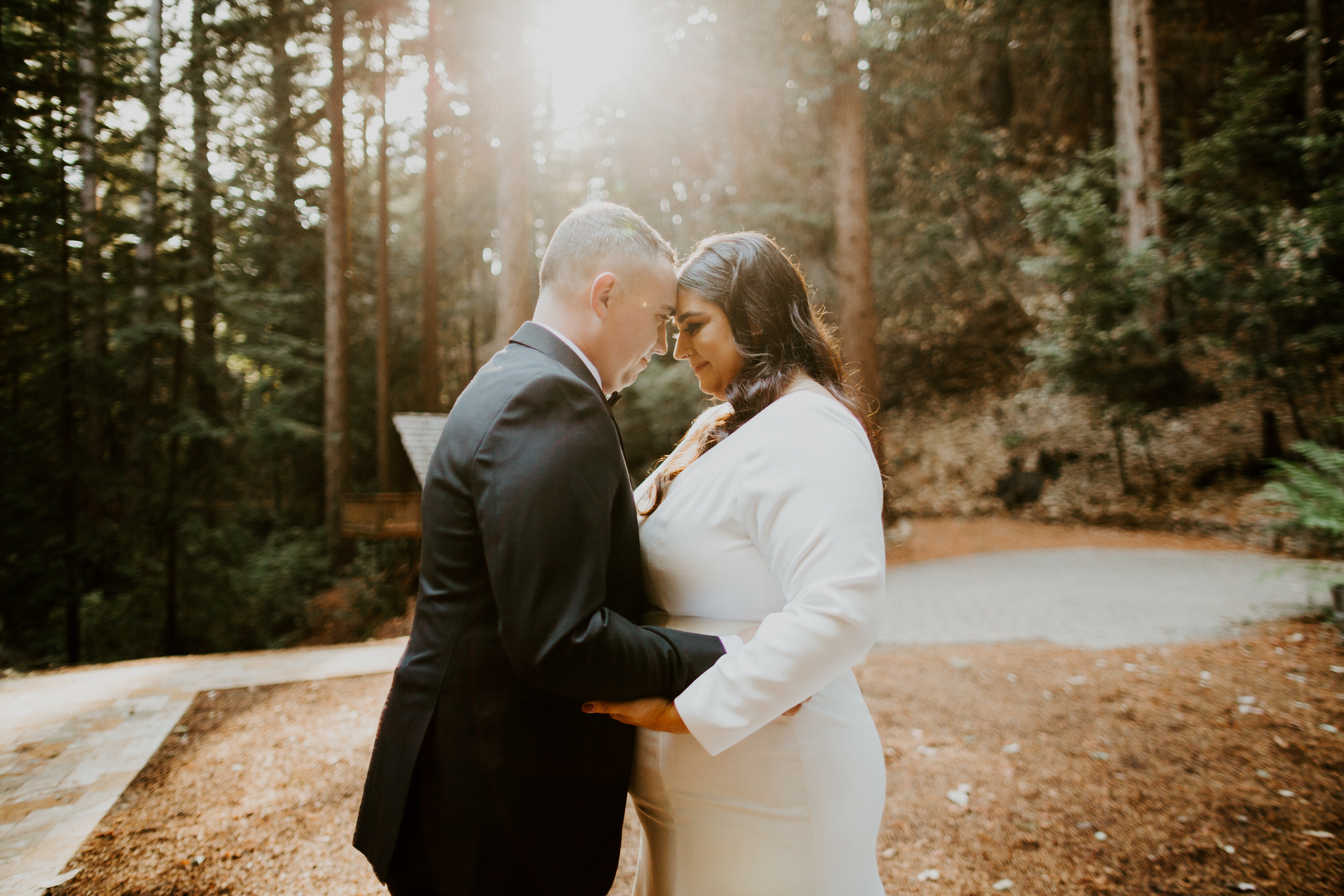
I am so excited to finally share all the details of Ashley and Andrew’s beautiful wedding stationery for their stunning wedding in the Santa Cruz woods!
I first met Ashley and Andrew about a year ago after their coordinator, Aime‘e Newlander of Weddings by Aime‘e, reached out to me. The four of us grabbed coffee and as we chatted about their wedding plans, I just knew their wedding stationery was going to be a dream project!
THE INSPIRATION
Ashley and Andrew love hiking, camping, and being outdoors, and were planning a fun-filled wedding weekend with their friends and family in Big Sur, California. They wanted their wedding stationery to be welcoming and feel personal, while still keeping an elegant vibe. We wanted to incorporate lots of deep greens, as well as some watercolor artwork of all of their favorite spots along the northern California coast!
THE SAVE THE DATES
For Ashley and Andrew’s Save the Dates, we wanted to go with something a little fun and different. Since their wedding was a destination wedding, I created a postcard to get their guests excited for a weekend in the woods! I created custom watercolor artwork of the iconic Bixby Bridge in Big Sur and did the details on the back of the card in an ombre deep green effect. The addresses were written in hand calligraphy and off they went!
THE INVITATION!
Next up was their invitation! Ashley and Andrew wanted a beautiful wedding invitation, but didn’t want it to feel “stuffy” and impersonal. We decided on a foldable style with plenty of personality and custom artwork to perfectly capture all of their favorite aspects of Northern California and their woodsy venue.
THE ARTWORK
We included a custom venue map to make sure their guests knew where to find parking, the ceremony, and, of course, the party! I also painted a watercolor map of the California coast to highlight some of Ashley and Andrew’s favorite hiking trails, campgrounds, and spots to grab a bite to eat on the journey north!
THE ENVELOPES
Ashley and Andrew wanted to keep their outer envelopes elegant, so they opted for a classic white envelope with black hand calligraphy. I also curated a collection of vintage and modern stamps to tie in their love of nature, their woodsy venue, and their color palette.
A great way to add a little sustainability to a wedding is a custom designed return address stamp! I designed one for Ashley & Andrew to perfectly match their invitation style. It’s not only a timesaver, but I love these stamps because you can keep using them long after the wedding is over – hello, thank you notes!
One of my favorite additions was their custom envelope liner (you all know how I feel about a good envelope liner)! Ashley and Andrew absolutely love visiting McWay Falls when they’re in Big Sur, so I created a watercolor painting of the falls and we used it for their envelope liners! It was such a fun surprise for their guests when they opened the envelope, and really elevated their suite, while still being full of Ashley and Andrew’s personality!
For their RSVP envelopes, we brought in that gorgeous dark green with white hand calligraphy and some more vintage postage (although these stamps were from 2015, so “lightly vintage”?).
KEEPING THE GUEST LIST SECURE
A common concern among my couples is that their guests might bring an uninvited date or show up with their whole entire family of twelve (we’ve all read those stories…). To ensure Ashley and Andrew’s guest list included only the people they had actually invited, we decided to include an inner envelope, but without the envelope.
Before you think too hard on that one, here’s how it worked: I wrote the guest’s name and address on the outer envelope so it would get delivered (duh), and on the inside flap of the folded invitation, I wrote the first names of the guests who were invited. I folded the invitation and put these in the envelope so that the names would be the first thing guests saw when they opened it up (and there would be no confusion about who was actually invited)! Personal AND practical!
IT HAS FLAPS!
Ashley and Andrew are avid adventurers and have spent a lot of time exploring Big Sur, so they know ALL the best places to stop! They wanted to share this info with their guests, along with the other wedding weekend details like where to stay and when to be ready for the shuttle. This was a lot of information to include on one tiny panel, so I designed their invitation to have flaps! It was basically the equivalent of putting pockets on a dress.
ENTER STAGE RIGHT: COVID 19
About eight months before Ashley and Andrew’s wedding, the world shut down due to COVID-19. At the time, we never imagined the crisis would extend into the fall, and we kept chugging along on designs and plans. Well COVID had other plans, and Ashley and Andrew ended up needing to significantly cut their guest list and eventually had to change their venue – cue lots of map redo-ing!
And as if planning a wedding during a pandemic wasn’t stressful enough, the wildfires raging in California came within yards of Ashley and Andrew’s new venue about a week before their invitations were set to go out. Luckily the venue was spared and their invitations went out without a hitch!
THE ENCLOSURES
Is it just me or are the enclosures sometimes just as fun as the actual invitation?! For Ashley and Andrew’s invite, we had three enclosures and they all tucked perfectly into the flaps on their invite. It was like a paper hug!
The first was their RSVP card, which I did in a portrait orientation to keep with the long lines of their invitation (and the loooooong lines of those redwood trees!). We also included a separate enclosure for their Welcome Dinner. Initially this was going to be a hosted dinner for family and the wedding party only, so only some of the guests would have received this card. However, once COVID became an issue and they decreased their guest list, Ashley and Andrew decided to include everyone in the Welcome Dinner!
Last up was a registry card. We typically don’t include this info with an invitation (it’s usually given out on a bridal shower invitation, website, or word of mouth), but hello, there’s a pandemic going on and bridal showers aren’t happenin’! We worded it tastefully and put it on a separate smaller card, and their guests appreciated having this info without to hunt around for it.
THE DAY-OF DETAILS
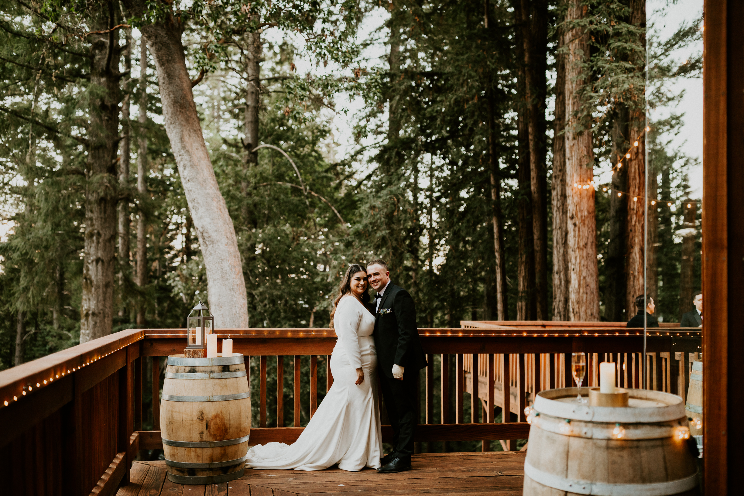
Ashley and Andrew knew from the very beginning that they wanted to incorporate my stone place cards into their day-of tablescape. The flat stones with a gold edge and hand calligraphy were the perfect blend of natural elements with a touch of elegance – just like their invitations. We decided to also include their wedding date and location on the back to make it a keepsake their guests would be sure to treasure!
We also wanted to showcase the amazing food, so I created a menu and pulled artwork from their invitation for a cohesive look. They also had a separate kids’ menu, so I created something a little more fun to keep the kiddos entertained!
After so many ups and downs during the planning process, Ashley and Andrew finally had the dreamiest wedding in the woods! Aime‘e planned and coordinated the most thoughtful, intimate day that was just SO beautiful and perfectly captured what Ashley and Andrew wanted their wedding to be. I’m still looking at these photos and gushing over just how stunning their wedding was, and how it just feels like THEM, even though the photos!
Congratulations on making it to the “Invitations” step on your wedding to-do list!
You might be wondering what in the name of holy matrimony an “invitation suite” is (hint: depending on who you ask, it’s slightly less exciting than the “honeymoon suite”).
I’m here to lay it all out for you – and put all of those suite pieces in order of importance so you know what you NEED (and what you can ditch to save money for the bar)!
INVITATION
Importance Level: CRUCIAL
Okay, the invitation part of your invitation suite is kind of the point of the whole thing. There’s no skipping this one. This is the piece that tells everyone where to be, when to be there, and even what to wear. So yeah, we’re gonna need to include this one or you’re just sending an empty envelope to your guests. Awkward.
Your invitation should have all the pertinent information your guests will need to actually attend your wedding successfully. Here’s an overview of the info you have to include:
– Your names – Wedding date – Ceremony time – Location (name & address) – Who’s hosting – Attire
This may seems obvious, but at this point I’ve seen it all and I can tell you that it is apparently not obvious to everyone. It’s also pretty bare-bones as far as info goes. You will likely have more tidbits that you’ll want to share, either via your wedding website or through additional inserts (keep reading for more on those!).
I’m assuming you have a working knowledge of how our postal service functions, so I’ll spare you the details on that. The important thing to know is that if you’re mailing your invites, you gotta put them in an envelope with an address, return address, and stamps. Obviously there is a lot of room for gussy-ing things up on the outside of an envelope, but these are the must-haves. Of course, if you’re doing a digital invite, outer envelopes are pretty useless and you may continue reading.
RSVP CARD & ENVELOPE
Importance Level: CRUCIAL/NICE TO HAVE
You’ll need a way for guests to let you know whether or not they’re coming, so the RSVP card is pretty crucial. Traditionally you’d include a card for them to mark their plan for attending and a stamped and addressed envelope for them to return it in (as the host, you want to make replying easy for them so they, you know, actually do it).
However, I marked the envelope as “nice to have” because with smaller weddings and all the technology we have these days, it’s totally fine to just include a card asking guests to RSVP on your website or shoot you an email or text. The elderly crowd isn’t always comfortable with these methods, so be sure to keep that in mind. And we can always include an envelope for your more traditional guests and ask the youngen’s to RSVP via the web!
RECEPTION CARD
Importance Level: CRUCIAL (but only if…)
The Reception Card only comes into play if your reception is in a different place than your ceremony. In this case, the invitation will invite your guests to the ceremony, then you’ll include another card inviting them to the reception and giving the timing and location details. This is especially helpful if you’re limiting the guests at the reception, since you can just include Reception Cards in those invitations and not others.
Of course if the ceremony and reception are in the same place, your guests are already there and you don’t need an extra insert to tell them to stay (the open bar and food will take care of that!).
DETAILS/INFO CARD
Importance Level: NICE TO HAVE
I don’t know about you, but I like to know ALL the details about a wedding before I show up without my jacket, wearing an outfit that’s too fancy, and late because I booked a hotel that’s too far away.
Enter the details card.
This is a great way to keep your guests in the loop on all those little details, like attire, where to stay, the plan for the weekend, and any other little tips and tricks that will make them more comfortable (including your COVID safety plan). Sometimes people will include an Accommodations Card, Events Card, or other information as separate inserts. This is totally fine, but if you have a lot of information to share, you may want to put it all on one card to cut down on the pieces of paper you have flying around (and postage).
Of course, if you have a wedding website, you can definitely refer your guests there for information and updates instead of including it in the invitation suite (which is super helpful with all the COVID pivoting we’re doing these days).
MAP / DIRECTIONS CARD
Importance Level: NICE TO HAVE
I LOVE maps! They are like little functional pieces of art and can really add to the beauty and personality of your invitation suite.
Now, it’s safe to argue that most of your guests are going to use their phones to get where they need to go for your wedding. However, it is nice to include a functional map and some written directions for your older guests, or in case someone’s phone runs out of battery or if your wedding is in an area with poor cell reception. This will ensure guests arrive on time (and aren’t chasing you down the aisle).
Maps are also a fun touch if you’re planning a destination wedding, have lots of out-of-town guests or multiple locations for your wedding events, or are getting married in a place that has lots of sentimental value to you two. For example, you can include your favorite nearby hiking trail, the coffee shop where you had your first date, or all the great tourist locations your guests should hit before they leave town (including the taco shack with the best burritos to cure a hangover).
ENVELOPE LINER
Importance Level: NICE TO HAVE
Envelope liners hold a special place in my heart. They are just so much fun and one of my absolute favorite places to add a pop of color or a personal touch to your invitation suite.
Aside from lookin’ pretty, envelope liners also actually help protect your invitation. That extra layer of paper acts as an added barrier between your envelope and the elements. It also keeps your dark envelopes from rubbing off on your beautiful white invitations.
Envelope liners aren’t a crucial piece of your invitation suite, but you should definitely consider them if you’re going with a darker envelope or mailing your invites to areas with lots of ugly weather going on. Or if your future spouse isn’t on board with putting your cat on the invite, you miiiiight be able to convince them to put it on the envelope liner.
INVITATION WRAP
Importance Level: NICE TO HAVE
A wrap is a great way to keep all of your suite pieces together and organized in the envelope. This is especially important if your stationer has designed your suite to look especially awesome when it’s stacked up (yes, I totally design invitation suites to look good as both a stack and as individual pieces!). You’ll want that awesomeness to arrive intact for your guests!
A wrap is a great way to keep all of your suite pieces together and organized in the envelope. This is especially important if your stationer has designed your suite to look especially awesome when it’s stacked up (yes, I totally design invitation suites to look good as both a stack and as individual pieces!). You’ll want that awesomeness to arrive intact for your guests!
Wraps can be full sheets, a small strip or belly band, ribbon, twine, wire, thread, or anything else you want to use to wrap around all of your pieces. They’re also a great place to personalize your invitations with custom artwork, quotes, or pops of color – I’ve got more fun personalization ideas on that here! Whatever wrap route you choose, it’s a great way to keep your invitation suite organized and make sure you look good on paper!
RAIN CARD
Importance Level: EXTRA
Traditionally a Rain Card gives guests an alternate location for the ceremony in case of rain. This insert has fallen out of style now that technology makes it so easy to get in touch with everyone (and great wedding planners know to, well, plan for inclement weather).
However, now that COVID is making any sort of planning ahead nearly impossible, it is nice to include some sort of note to your guests to point them in the right direction if they need more information. Of course, we can include this info in your details card, which is why a Rain Card (or COVID Card?) is in the Extra category.
INNER ENVELOPE
Importance Level: EXTRA
You might be wondering why on earth you need an inner envelope if you have an outer envelope. And you’re not wrong. But this extra envelope does serve a purpose beyond being something else to lick.
The inner envelope lists the names of the guests who are invited, which is a great way to gently reinforce that your guests can’t bring kids or a date (if that’s the case). For example, on the outer envelope you may put “Mr. James Harrison and Family”, while on the inner envelope you would list “Uncle James, Aunt Marie, Brandon, Haley, and Paul” so Uncle James and Aunt Marie know the kids are all welcome.
If you’re going for a luxe and fancy event, I’d totally encourage using an inner envelope to help set the tone for your event. However, if you’re planning a more casual event, there are other ways to accomplish a set guest list without an inner envelope, which is why I’m calling it Extra.
REGISTRY INFO
Importance Level: LEAVE IT OUT
Etiquette says you never include your registry info on your invitation (it’s kind of like asking for gifts…icky). Typically you’d put this info on your wedding website, ask a friend or family member to tactfully pass the registry info around, or it would be shared with a wedding shower invitation.
However, COVID has really thrown a monkey wrench into the traditional wedding gatherings and there’s nothing like a pandemic to make people reprioritize all of those etiquette rules. If you don’t have a website and didn’t have a wedding shower, it is fine to include a separate, small, tastefully worded card with your registry info in your invitation. Pandemic or not, please don’t put your registry info on the actual invitation.
“NO KIDS”
Importance Level: LEAVE IT OUT
It’s totally okay to NOT want kids at your wedding. I have two of them who I love dearly, but can confirm without a doubt that they are not formal event material.
While simply putting “no kids” gets the message across loud and clear, it’s a little, er, harsh to put in print on an invitation (even in beautiful scripted letterpress). If you’re planning an adults-only event, we’ve got subtle ways to ensure that the bib & booster seat crowd don’t show up uninvited.
First, there’s the outer envelope – address it ONLY to the parents. Then you can add an inner envelope and address that ONLY to the parents. You can also put a tactfully worded note about the event being adults-only on your wedding website, along with some suggestions for childcare (if you have them). And lastly, you can use your planner or a close relative to spread the word on the no-kids situation.
YOUR MARRIED NAME
Importance Level: LEAVE IT OUT
We know you’re excited for that new last name, but putting it on your invitation is TOO SOON. Go with your maiden name for all of your wedding invitation stationery and save your married name for your reception place card and literally everything else for the rest of your life!
Congratulations! You are now an expert in what you need for your invitations! Just don’t forget that your invitations are the first impression your guests will have of your wedding and I’m always here if you need any help looking good on paper!