

I am so excited to finally share all the details of Ashley and Andrew’s beautiful wedding stationery for their stunning wedding in the Santa Cruz woods!
I first met Ashley and Andrew about a year ago after their coordinator, Aime‘e Newlander of Weddings by Aime‘e, reached out to me. The four of us grabbed coffee and as we chatted about their wedding plans, I just knew their wedding stationery was going to be a dream project!

THE INSPIRATION
Ashley and Andrew love hiking, camping, and being outdoors, and were planning a fun-filled wedding weekend with their friends and family in Big Sur, California. They wanted their wedding stationery to be welcoming and feel personal, while still keeping an elegant vibe. We wanted to incorporate lots of deep greens, as well as some watercolor artwork of all of their favorite spots along the northern California coast!
THE SAVE THE DATES
For Ashley and Andrew’s Save the Dates, we wanted to go with something a little fun and different. Since their wedding was a destination wedding, I created a postcard to get their guests excited for a weekend in the woods! I created custom watercolor artwork of the iconic Bixby Bridge in Big Sur and did the details on the back of the card in an ombre deep green effect. The addresses were written in hand calligraphy and off they went!

THE INVITATION!
Next up was their invitation! Ashley and Andrew wanted a beautiful wedding invitation, but didn’t want it to feel “stuffy” and impersonal. We decided on a foldable style with plenty of personality and custom artwork to perfectly capture all of their favorite aspects of Northern California and their woodsy venue.

THE ARTWORK
We included a custom venue map to make sure their guests knew where to find parking, the ceremony, and, of course, the party! I also painted a watercolor map of the California coast to highlight some of Ashley and Andrew’s favorite hiking trails, campgrounds, and spots to grab a bite to eat on the journey north!

THE ENVELOPES
Ashley and Andrew wanted to keep their outer envelopes elegant, so they opted for a classic white envelope with black hand calligraphy. I also curated a collection of vintage and modern stamps to tie in their love of nature, their woodsy venue, and their color palette.
A great way to add a little sustainability to a wedding is a custom designed return address stamp! I designed one for Ashley & Andrew to perfectly match their invitation style. It’s not only a timesaver, but I love these stamps because you can keep using them long after the wedding is over – hello, thank you notes!


One of my favorite additions was their custom envelope liner (you all know how I feel about a good envelope liner)! Ashley and Andrew absolutely love visiting McWay Falls when they’re in Big Sur, so I created a watercolor painting of the falls and we used it for their envelope liners! It was such a fun surprise for their guests when they opened the envelope, and really elevated their suite, while still being full of Ashley and Andrew’s personality!
For their RSVP envelopes, we brought in that gorgeous dark green with white hand calligraphy and some more vintage postage (although these stamps were from 2015, so “lightly vintage”?).

KEEPING THE GUEST LIST SECURE
A common concern among my couples is that their guests might bring an uninvited date or show up with their whole entire family of twelve (we’ve all read those stories…). To ensure Ashley and Andrew’s guest list included only the people they had actually invited, we decided to include an inner envelope, but without the envelope.
Before you think too hard on that one, here’s how it worked: I wrote the guest’s name and address on the outer envelope so it would get delivered (duh), and on the inside flap of the folded invitation, I wrote the first names of the guests who were invited. I folded the invitation and put these in the envelope so that the names would be the first thing guests saw when they opened it up (and there would be no confusion about who was actually invited)! Personal AND practical!

IT HAS FLAPS!
Ashley and Andrew are avid adventurers and have spent a lot of time exploring Big Sur, so they know ALL the best places to stop! They wanted to share this info with their guests, along with the other wedding weekend details like where to stay and when to be ready for the shuttle. This was a lot of information to include on one tiny panel, so I designed their invitation to have flaps! It was basically the equivalent of putting pockets on a dress.

ENTER STAGE RIGHT: COVID 19
About eight months before Ashley and Andrew’s wedding, the world shut down due to COVID-19. At the time, we never imagined the crisis would extend into the fall, and we kept chugging along on designs and plans. Well COVID had other plans, and Ashley and Andrew ended up needing to significantly cut their guest list and eventually had to change their venue – cue lots of map redo-ing!
And as if planning a wedding during a pandemic wasn’t stressful enough, the wildfires raging in California came within yards of Ashley and Andrew’s new venue about a week before their invitations were set to go out. Luckily the venue was spared and their invitations went out without a hitch!
THE ENCLOSURES
Is it just me or are the enclosures sometimes just as fun as the actual invitation?! For Ashley and Andrew’s invite, we had three enclosures and they all tucked perfectly into the flaps on their invite. It was like a paper hug!
The first was their RSVP card, which I did in a portrait orientation to keep with the long lines of their invitation (and the loooooong lines of those redwood trees!). We also included a separate enclosure for their Welcome Dinner. Initially this was going to be a hosted dinner for family and the wedding party only, so only some of the guests would have received this card. However, once COVID became an issue and they decreased their guest list, Ashley and Andrew decided to include everyone in the Welcome Dinner!
Last up was a registry card. We typically don’t include this info with an invitation (it’s usually given out on a bridal shower invitation, website, or word of mouth), but hello, there’s a pandemic going on and bridal showers aren’t happenin’! We worded it tastefully and put it on a separate smaller card, and their guests appreciated having this info without to hunt around for it.
THE DAY-OF DETAILS

Ashley and Andrew knew from the very beginning that they wanted to incorporate my stone place cards into their day-of tablescape. The flat stones with a gold edge and hand calligraphy were the perfect blend of natural elements with a touch of elegance – just like their invitations. We decided to also include their wedding date and location on the back to make it a keepsake their guests would be sure to treasure!
We also wanted to showcase the amazing food, so I created a menu and pulled artwork from their invitation for a cohesive look. They also had a separate kids’ menu, so I created something a little more fun to keep the kiddos entertained!

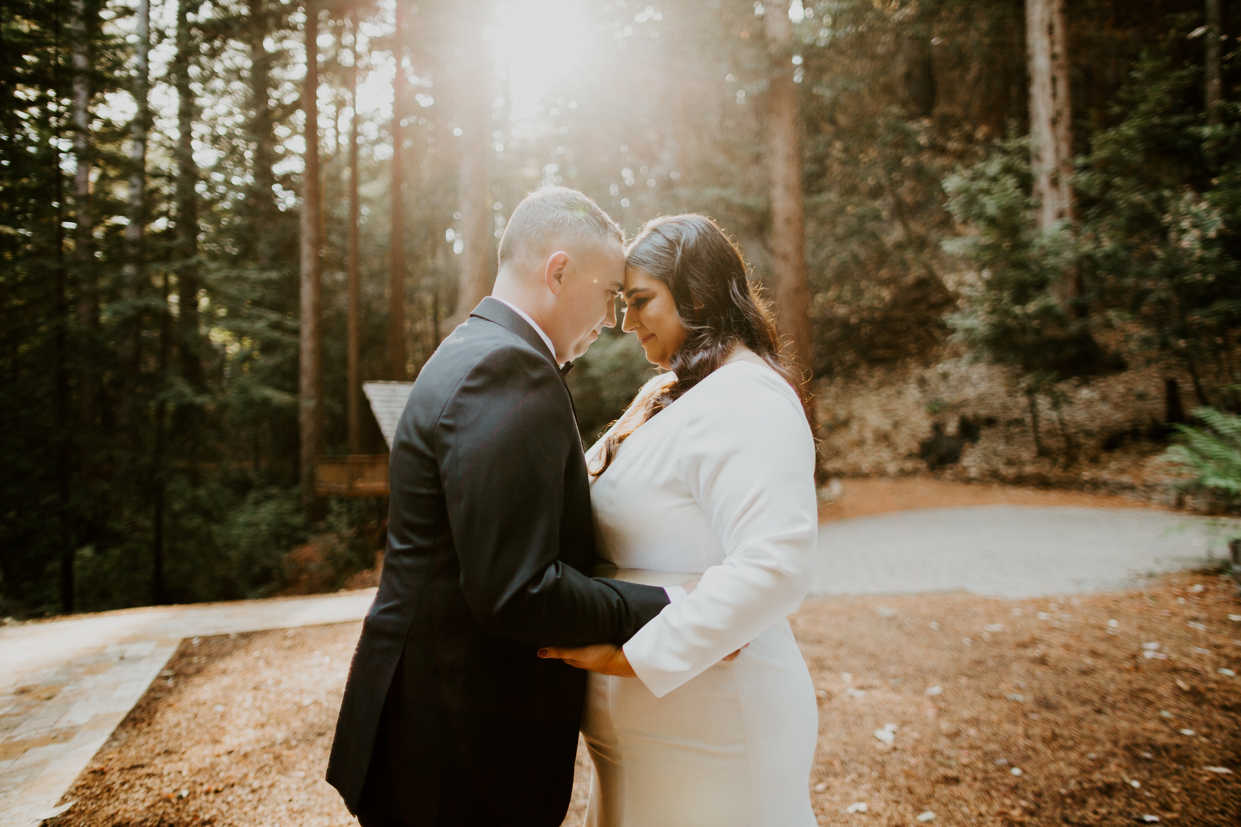
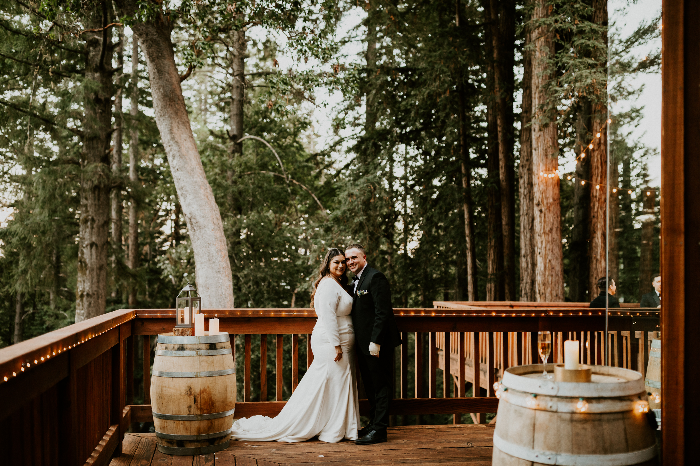
After so many ups and downs during the planning process, Ashley and Andrew finally had the dreamiest wedding in the woods! Aime‘e planned and coordinated the most thoughtful, intimate day that was just SO beautiful and perfectly captured what Ashley and Andrew wanted their wedding to be. I’m still looking at these photos and gushing over just how stunning their wedding was, and how it just feels like THEM, even though the photos!


Planning & Coordination: Aime‘e Newlander, Weddings by Aimee
Photography: Joshua Rose Photography
Venue: Sequoia Retreat Center