When it comes to wedding invitations, it’s all about making a lasting impression. From the fonts you choose to the color palette, every detail sets the tone for your big day. But here’s one small yet powerful detail that often gets overlooked—envelope liners.
Adding an envelope liner to your wedding invitation may seem like a subtle touch, but it elevates your overall design and makes everything feel just a bit more…luxurious. Think of it like the icing on a cake—the perfect finishing touch that completes the whole aesthetic.
What are Envelope Liners?
Envelope liners are basically a sheet of paper placed inside the envelope, cut to match the flap of the envelope. They got their start as a layer of extra protection for letters back in the day when mail traveled in a saddle bag (not sure a USPS truck is much better, but at least it doesn’t smell like manure?). Nowadays, envelope liners are mostly used for an extra layer of visual interest, and can be as simple or as intricate as you like – adding a pop of color or a subtle nod to your wedding venue.
Why Envelope Liners Make a Difference
Instant Elegance: The moment your guest opens their invitation, they’re greeted with a peek of something special. That first impression counts, and a chic envelope liner immediately conveys a sense of luxury. It’s a small detail that creates a big impact!
Complete the Look: Your wedding invitations are likely part of a larger design theme. Whether you’re going for a vintage, modern, minimalistic, or glam aesthetic, envelope liners can tie everything together. A simple pattern or color can reflect your overall wedding vibe, creating a cohesive and polished look.
Customizable and Personal: Envelope liners give you another opportunity to showcase your personality. You can incorporate your wedding colors, monogram, your labradoodle, or any design that’s meaningful to you and your partner—like a map of the place you met or a subtle nod to a favorite hobby. It’s a personalized touch that feels incredibly special.
Luxury Feel: Let’s face it—anything that’s unexpected, like a hidden detail, feels luxurious. The element of surprise when your guests see that beautiful liner inside the envelope gives them a “wow” moment. It’s the kind of touch that will make your wedding stand out in their minds long after the day is over.
How to Choose the Right Envelope Liner
The key to making an envelope liner work is balance. It should complement the design of your invitation—not overwhelm it. If you’ve opted for a bold, intricate design on your invitations, a more understated liner in a soft color might work best. On the other hand, if your invites are simple and clean, a patterned or metallic liner can add some wow-factor.
It’s also important to think about the envelope itself. The liner should fit perfectly within the envelope, giving your invitation that polished, high-end feel. Make sure you work with a skilled designer or stationer to ensure the liner is tailored to fit your chosen envelopes, so everything looks just right.
Our collection of envelope liners has tons of designs, colors, and styles to match whatever vibe you’re going for. We offer envelope liners in different formats, including a digital download for you to print and cut yourself, liners on their own, and fully lined envelopes (if DIY isn’t your jam). Shop the whole collection here!
Final Thoughts
Adding an envelope liner is a small investment that can make your wedding invitations feel incredibly luxurious and thoughtful. It’s one of those details that will have your guests texting you about your gorgeous invitations as soon as they open their mailboxes. Whether you go for something simple and elegant or bold and creative, the effect is the same—it takes your wedding stationery to the next level.
As you’re finalizing those wedding invitation details, don’t forget about the envelope liners. Trust us, they’re worth it!
When it comes down to it, place cards have a pretty utilitarian job – they tell your guests where to sit.
But just because place cards have a practical purpose doesn’t mean they can’t look pretty while they’re doing it, right?!
Right!
Today I’m sharing my favorite place cards that your guests will actually want to take home! Read on for all the place card inspiration you could ever need!
RIVER ROCKS
I wish I looked this good after being dragged out of a river…
These stunning river rocks are the PERFECT blend of nature and luxury! I love them so much for an outdoor or mountain wedding – they add just a little touch of “fancy” (without being stuffy) that your guests won’t expect.
But guess what!
They’re also so perfect for a formal indoor wedding! Those gorgeous stones will add a hint of nature that will have your guests thinking you’re an uber-hip design genius (which you are!). Of course the icing on the wedding cake is that these place cards are so pretty, you know your guests will be taking them home to proudly display!
Need some river rock place cards in your life? Find ’em here!
PAPER SCROLLS
Are you ready to have all of your princess dreams come true? Because these paper scroll place cards are so perfectly luxurious that we’re pretty sure the Queen herself would approve. Add on some romantic hand calligraphy and you’ll have Belle, Cinderella, Sleeping Beauty, and Ariel knocking on your door asking where you got them (psst: you can get them here!)
Hear ye, hear ye! Thus entereth the most breathtaking place card in all the land!
These place cards are so much fun to style, too! You can hang them over the edge of a champagne flute, tuck them in the tines of a fork, wrap them around a napkin, or attach them to the edge of your menu. Any way you do it, your guests are sure to feel like they’re in a fairy tale!
TERRA COTTA POTS
When life gives you lemons, turn ’em into place cards!
These terra cotta pots might be THE CUTEST place cards of the bunch! Honestly, the possibilities here are end.less. I love playing up the rustic vibe of these pots with bold colors and brush calligraphy, then filling them with a cute succulent or herb.
If you’re lookin’ to fancy things up, painting the top edge black or gold will add a luxe vibe. Fill them with French macarons for a sweet treat!
I also love color blocking these little pots with geometric shapes for a more modern look! Toss in some greenery, a bag of loose tea, or a candle and you’ve got the perfect place card/favor duo!
And Cutest Place Card goes to…
AGATE SLICES
Apparently being squished between a bunch of volcanic rock for a really long time has its benefits, because these agate slices are STUNNERS!
Agates make gorgeous place cards and come in a range of colors, from neutral tans and grays to hot pink. I just love the fact that each one is different so each of your guests gets a totally unique piece!
Agate slices look fantastic when they’re totally natural with a touch of calligraphy. But if you’re going for a totally glam effect, gold edging takes these to the next level of chic.
You can also drill holes in agates and turn them into key chains that your guests will be thrilled to show off every time they park at a valet. Or go for the larger size agates and they can double as a gorgeous coaster. Who wouldn’t want to plop their morning coffee on something so pretty?
You can find these beauties (in a rainbow of colors!) HERE!
TORN PAPER PLACE CARDS
Kelley Williams Photography
I absolutely adore the look of torn paper to add a romantic feel to any table scape. Those deckled edges are just so much softer and organic than a harsh straight cut. The torn paper accent on these is also absolutely lovely, and is the perfect way to add a pop of color or tie in your floral palette!
As an added bonus, these torn paper place cards are a great way to add a little sustainability to your wedding since they’re created using scrap paper!
SILK RIBBON
Kelley Williams Photography
If you used silk ribbon in your wedding invitation, I highly recommend finding a way to incorporate it into your wedding day tablescape! For one, silk ribbon is, like, really pretty. Like, I’d put it on anything. Or everything.
Two, I just love how thoughtful and cohesive an event feels when little details are carried throughout. Remember that your invitation sets the tone and style for your wedding, so incorporating those accessories into your actual wedding day keeps your wedding style consistent and your guests thinking you’ve really got it all together (even if the caterer dropped a whole lasagna, the officiant used the wrong names, and you forgot to put on deodorant).
MARBLE TILES
Ashley Ludaescher Photography
If you haven’t already noticed, I love mixing chic, romantic vibes with edgier, natural elements, and marble is one of my favorite ways to accomplish this! Marble tiles are so versa-TILE (I can’t help myself, I’m not even sorry) and come in a wide range of sizes, shapes, and colors to fit in with the style of any event.
I also love adding a painted edge to these tiles to really give them a luxe feel! It’s a great way to bring in a few of the bolder colors of your palette without it being too much (no one wants to hear Aunt Linda talk about turquoise “not being a wedding color” for the rest of their lives).
FLORALS
If you really want to get your guests’ jaws on the floor, use your florals as place cards! I absolutely adore this bird of paradise place card for a tropical wedding. I mean, can you imagine sitting down at a table with this stunner on your plate? People would be setting up whole Instagram accounts just for this place card!
Obviously this place card works best with the sturdier plants that have ample room for lettering – bird of paradise, succulents, magnolia leaves, and monstera leaves are all great options.
You’ll also need to keep in mind that they’ll need to survive from the time your calligrapher works their magic to the actual reception, so I recommend a test-drive first. (For the record, these bird of paradises looked perfect for about 3-4 days with no water, and probably could have made it to 5-7 days if I had kept them in water.)
FRUITS
Okay, place cards that are edible automatically score bonus points in my book!
Isn’t this little tangerine giving the terra cotta pots a run for their money in the cute category? I am obsessed with the combo of the paper leaf on an actual piece of fruit – it’s so whimsical and practical at the same time! Using a paper leaf is super budget-friendly and your calligrapher can do your lettering whenever!
Of course, you could also choose to letter directly on the fruit (or vegetable)! I love how calligraphy looks on pears and pomegranates! Just remember that calligraphy ink usually isn’t edible, so you may need to keep an eye on your munchier guests…
ACRYLIC PLACE CARDS
Acrylic place cards are one of my favorites because they’re just SO versatile! You can paint them literally any color, or leave them clear to let your menu really shine! (And honestly, this coordinating hexagon menu is PERFECTION with that hexagon acrylic tile, right?! You can find the menus here and the place cards here!)
I’m also a huge fan of dressing up acrylic tiles will a little gold leaf, because as you better well know if you’ve made it this far, I love mixing modern and rustic. I mean, look how chic and pretty these are!
There you have it, friends – all of my favorite place cards rounded up in one post! I think I’ll have to just refer to this post as my Happy Place (Card) from now on…
Let me know which one was your favorite down in the comments!
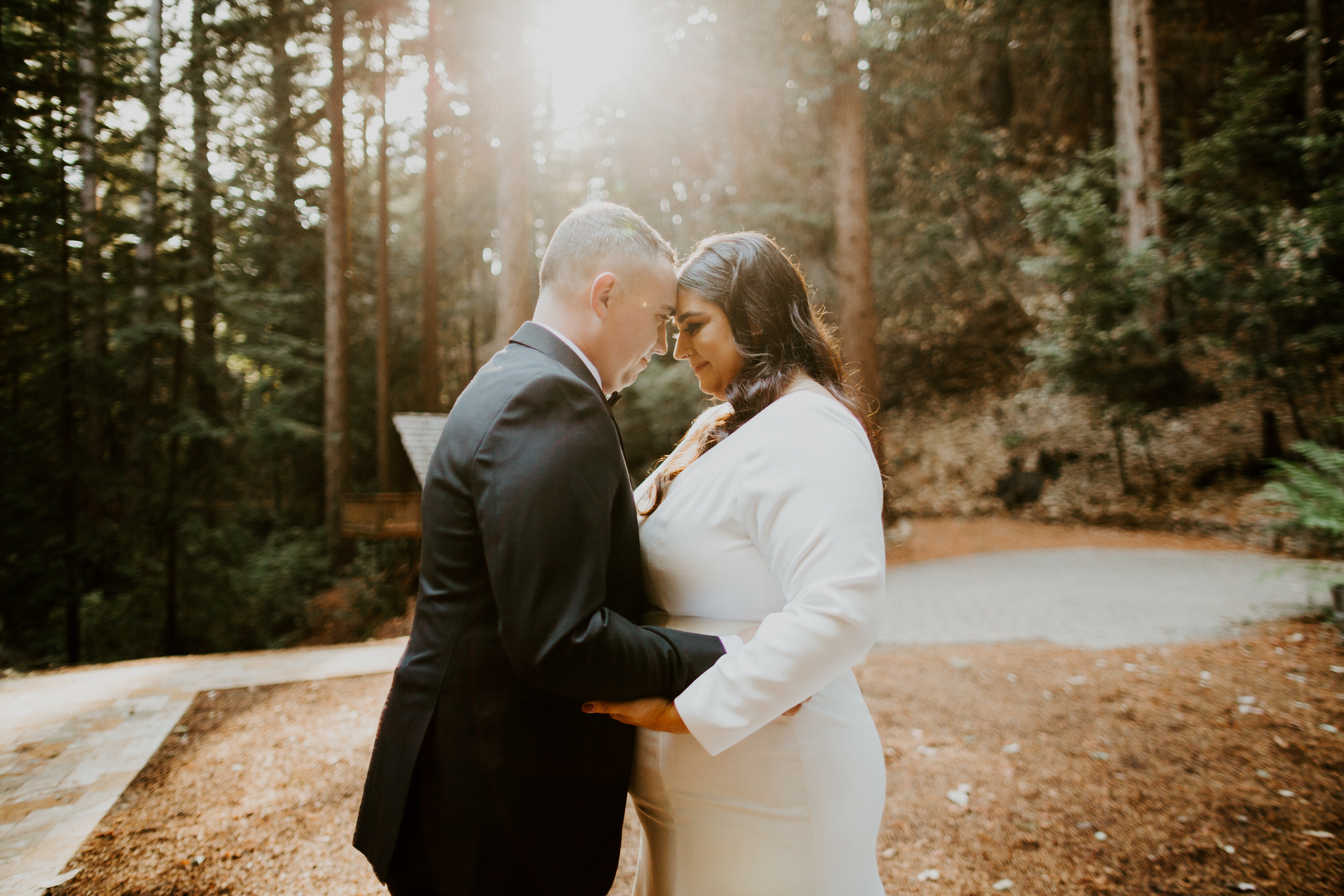
I am so excited to finally share all the details of Ashley and Andrew’s beautiful wedding stationery for their stunning wedding in the Santa Cruz woods!
I first met Ashley and Andrew about a year ago after their coordinator, Aime‘e Newlander of Weddings by Aime‘e, reached out to me. The four of us grabbed coffee and as we chatted about their wedding plans, I just knew their wedding stationery was going to be a dream project!
THE INSPIRATION
Ashley and Andrew love hiking, camping, and being outdoors, and were planning a fun-filled wedding weekend with their friends and family in Big Sur, California. They wanted their wedding stationery to be welcoming and feel personal, while still keeping an elegant vibe. We wanted to incorporate lots of deep greens, as well as some watercolor artwork of all of their favorite spots along the northern California coast!
THE SAVE THE DATES
For Ashley and Andrew’s Save the Dates, we wanted to go with something a little fun and different. Since their wedding was a destination wedding, I created a postcard to get their guests excited for a weekend in the woods! I created custom watercolor artwork of the iconic Bixby Bridge in Big Sur and did the details on the back of the card in an ombre deep green effect. The addresses were written in hand calligraphy and off they went!
THE INVITATION!
Next up was their invitation! Ashley and Andrew wanted a beautiful wedding invitation, but didn’t want it to feel “stuffy” and impersonal. We decided on a foldable style with plenty of personality and custom artwork to perfectly capture all of their favorite aspects of Northern California and their woodsy venue.
THE ARTWORK
We included a custom venue map to make sure their guests knew where to find parking, the ceremony, and, of course, the party! I also painted a watercolor map of the California coast to highlight some of Ashley and Andrew’s favorite hiking trails, campgrounds, and spots to grab a bite to eat on the journey north!
THE ENVELOPES
Ashley and Andrew wanted to keep their outer envelopes elegant, so they opted for a classic white envelope with black hand calligraphy. I also curated a collection of vintage and modern stamps to tie in their love of nature, their woodsy venue, and their color palette.
A great way to add a little sustainability to a wedding is a custom designed return address stamp! I designed one for Ashley & Andrew to perfectly match their invitation style. It’s not only a timesaver, but I love these stamps because you can keep using them long after the wedding is over – hello, thank you notes!
One of my favorite additions was their custom envelope liner (you all know how I feel about a good envelope liner)! Ashley and Andrew absolutely love visiting McWay Falls when they’re in Big Sur, so I created a watercolor painting of the falls and we used it for their envelope liners! It was such a fun surprise for their guests when they opened the envelope, and really elevated their suite, while still being full of Ashley and Andrew’s personality!
For their RSVP envelopes, we brought in that gorgeous dark green with white hand calligraphy and some more vintage postage (although these stamps were from 2015, so “lightly vintage”?).
KEEPING THE GUEST LIST SECURE
A common concern among my couples is that their guests might bring an uninvited date or show up with their whole entire family of twelve (we’ve all read those stories…). To ensure Ashley and Andrew’s guest list included only the people they had actually invited, we decided to include an inner envelope, but without the envelope.
Before you think too hard on that one, here’s how it worked: I wrote the guest’s name and address on the outer envelope so it would get delivered (duh), and on the inside flap of the folded invitation, I wrote the first names of the guests who were invited. I folded the invitation and put these in the envelope so that the names would be the first thing guests saw when they opened it up (and there would be no confusion about who was actually invited)! Personal AND practical!
IT HAS FLAPS!
Ashley and Andrew are avid adventurers and have spent a lot of time exploring Big Sur, so they know ALL the best places to stop! They wanted to share this info with their guests, along with the other wedding weekend details like where to stay and when to be ready for the shuttle. This was a lot of information to include on one tiny panel, so I designed their invitation to have flaps! It was basically the equivalent of putting pockets on a dress.
ENTER STAGE RIGHT: COVID 19
About eight months before Ashley and Andrew’s wedding, the world shut down due to COVID-19. At the time, we never imagined the crisis would extend into the fall, and we kept chugging along on designs and plans. Well COVID had other plans, and Ashley and Andrew ended up needing to significantly cut their guest list and eventually had to change their venue – cue lots of map redo-ing!
And as if planning a wedding during a pandemic wasn’t stressful enough, the wildfires raging in California came within yards of Ashley and Andrew’s new venue about a week before their invitations were set to go out. Luckily the venue was spared and their invitations went out without a hitch!
THE ENCLOSURES
Is it just me or are the enclosures sometimes just as fun as the actual invitation?! For Ashley and Andrew’s invite, we had three enclosures and they all tucked perfectly into the flaps on their invite. It was like a paper hug!
The first was their RSVP card, which I did in a portrait orientation to keep with the long lines of their invitation (and the loooooong lines of those redwood trees!). We also included a separate enclosure for their Welcome Dinner. Initially this was going to be a hosted dinner for family and the wedding party only, so only some of the guests would have received this card. However, once COVID became an issue and they decreased their guest list, Ashley and Andrew decided to include everyone in the Welcome Dinner!
Last up was a registry card. We typically don’t include this info with an invitation (it’s usually given out on a bridal shower invitation, website, or word of mouth), but hello, there’s a pandemic going on and bridal showers aren’t happenin’! We worded it tastefully and put it on a separate smaller card, and their guests appreciated having this info without to hunt around for it.
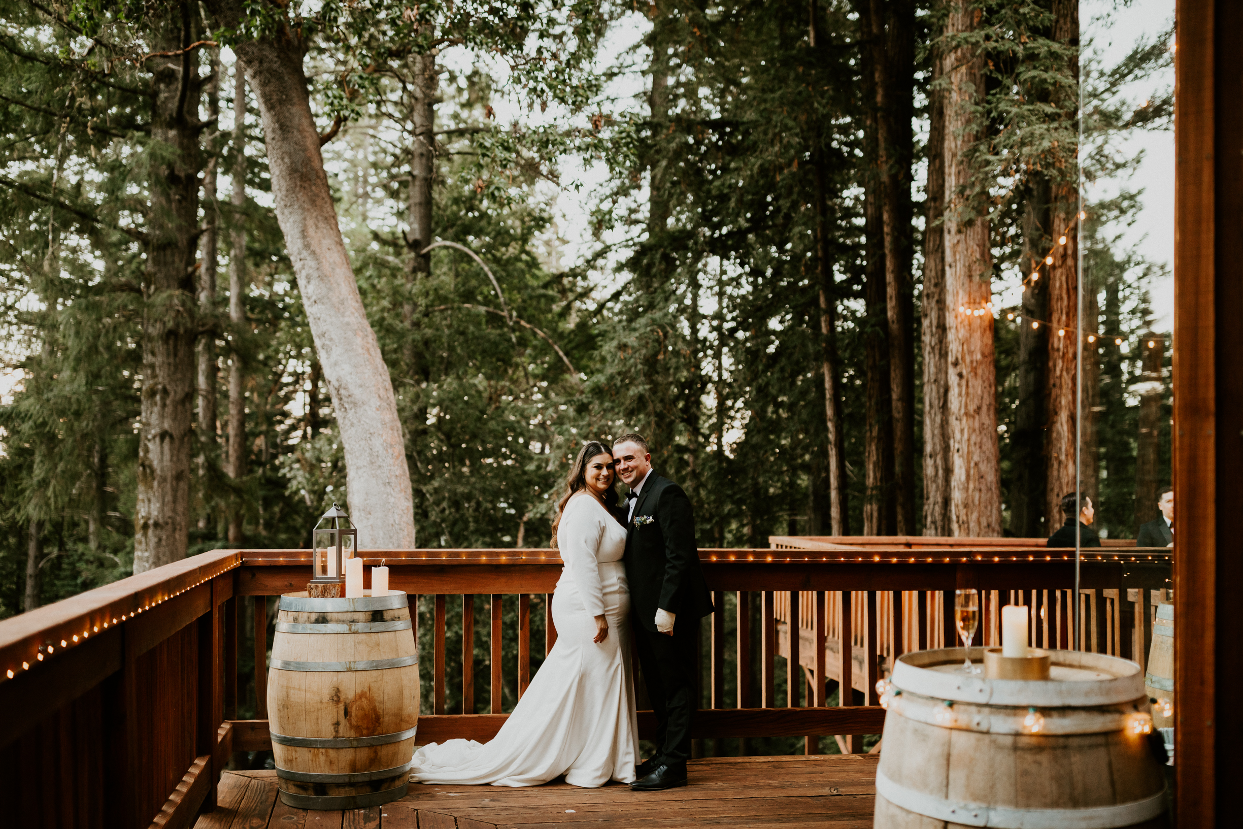
THE DAY-OF DETAILS
Ashley and Andrew knew from the very beginning that they wanted to incorporate my stone place cards into their day-of tablescape. The flat stones with a gold edge and hand calligraphy were the perfect blend of natural elements with a touch of elegance – just like their invitations. We decided to also include their wedding date and location on the back to make it a keepsake their guests would be sure to treasure!
We also wanted to showcase the amazing food, so I created a menu and pulled artwork from their invitation for a cohesive look. They also had a separate kids’ menu, so I created something a little more fun to keep the kiddos entertained!
After so many ups and downs during the planning process, Ashley and Andrew finally had the dreamiest wedding in the woods! Aime‘e planned and coordinated the most thoughtful, intimate day that was just SO beautiful and perfectly captured what Ashley and Andrew wanted their wedding to be. I’m still looking at these photos and gushing over just how stunning their wedding was, and how it just feels like THEM, even though the photos!
Congratulations on making it to the “Invitations” step on your wedding to-do list!
You might be wondering what in the name of holy matrimony an “invitation suite” is (hint: depending on who you ask, it’s slightly less exciting than the “honeymoon suite”).
I’m here to lay it all out for you – and put all of those suite pieces in order of importance so you know what you NEED (and what you can ditch to save money for the bar)!
INVITATION
Importance Level: CRUCIAL
Okay, the invitation part of your invitation suite is kind of the point of the whole thing. There’s no skipping this one. This is the piece that tells everyone where to be, when to be there, and even what to wear. So yeah, we’re gonna need to include this one or you’re just sending an empty envelope to your guests. Awkward.
Your invitation should have all the pertinent information your guests will need to actually attend your wedding successfully. Here’s an overview of the info you have to include:
– Your names – Wedding date – Ceremony time – Location (name & address) – Who’s hosting – Attire
This may seems obvious, but at this point I’ve seen it all and I can tell you that it is apparently not obvious to everyone. It’s also pretty bare-bones as far as info goes. You will likely have more tidbits that you’ll want to share, either via your wedding website or through additional inserts (keep reading for more on those!).
I’m assuming you have a working knowledge of how our postal service functions, so I’ll spare you the details on that. The important thing to know is that if you’re mailing your invites, you gotta put them in an envelope with an address, return address, and stamps. Obviously there is a lot of room for gussy-ing things up on the outside of an envelope, but these are the must-haves. Of course, if you’re doing a digital invite, outer envelopes are pretty useless and you may continue reading.
RSVP CARD & ENVELOPE
Importance Level: CRUCIAL/NICE TO HAVE
You’ll need a way for guests to let you know whether or not they’re coming, so the RSVP card is pretty crucial. Traditionally you’d include a card for them to mark their plan for attending and a stamped and addressed envelope for them to return it in (as the host, you want to make replying easy for them so they, you know, actually do it).
However, I marked the envelope as “nice to have” because with smaller weddings and all the technology we have these days, it’s totally fine to just include a card asking guests to RSVP on your website or shoot you an email or text. The elderly crowd isn’t always comfortable with these methods, so be sure to keep that in mind. And we can always include an envelope for your more traditional guests and ask the youngen’s to RSVP via the web!
RECEPTION CARD
Importance Level: CRUCIAL (but only if…)
The Reception Card only comes into play if your reception is in a different place than your ceremony. In this case, the invitation will invite your guests to the ceremony, then you’ll include another card inviting them to the reception and giving the timing and location details. This is especially helpful if you’re limiting the guests at the reception, since you can just include Reception Cards in those invitations and not others.
Of course if the ceremony and reception are in the same place, your guests are already there and you don’t need an extra insert to tell them to stay (the open bar and food will take care of that!).
DETAILS/INFO CARD
Importance Level: NICE TO HAVE
I don’t know about you, but I like to know ALL the details about a wedding before I show up without my jacket, wearing an outfit that’s too fancy, and late because I booked a hotel that’s too far away.
Enter the details card.
This is a great way to keep your guests in the loop on all those little details, like attire, where to stay, the plan for the weekend, and any other little tips and tricks that will make them more comfortable (including your COVID safety plan). Sometimes people will include an Accommodations Card, Events Card, or other information as separate inserts. This is totally fine, but if you have a lot of information to share, you may want to put it all on one card to cut down on the pieces of paper you have flying around (and postage).
Of course, if you have a wedding website, you can definitely refer your guests there for information and updates instead of including it in the invitation suite (which is super helpful with all the COVID pivoting we’re doing these days).
MAP / DIRECTIONS CARD
Importance Level: NICE TO HAVE
I LOVE maps! They are like little functional pieces of art and can really add to the beauty and personality of your invitation suite.
Now, it’s safe to argue that most of your guests are going to use their phones to get where they need to go for your wedding. However, it is nice to include a functional map and some written directions for your older guests, or in case someone’s phone runs out of battery or if your wedding is in an area with poor cell reception. This will ensure guests arrive on time (and aren’t chasing you down the aisle).
Maps are also a fun touch if you’re planning a destination wedding, have lots of out-of-town guests or multiple locations for your wedding events, or are getting married in a place that has lots of sentimental value to you two. For example, you can include your favorite nearby hiking trail, the coffee shop where you had your first date, or all the great tourist locations your guests should hit before they leave town (including the taco shack with the best burritos to cure a hangover).
ENVELOPE LINER
Importance Level: NICE TO HAVE
Envelope liners hold a special place in my heart. They are just so much fun and one of my absolute favorite places to add a pop of color or a personal touch to your invitation suite.
Aside from lookin’ pretty, envelope liners also actually help protect your invitation. That extra layer of paper acts as an added barrier between your envelope and the elements. It also keeps your dark envelopes from rubbing off on your beautiful white invitations.
Envelope liners aren’t a crucial piece of your invitation suite, but you should definitely consider them if you’re going with a darker envelope or mailing your invites to areas with lots of ugly weather going on. Or if your future spouse isn’t on board with putting your cat on the invite, you miiiiight be able to convince them to put it on the envelope liner.
INVITATION WRAP
Importance Level: NICE TO HAVE
A wrap is a great way to keep all of your suite pieces together and organized in the envelope. This is especially important if your stationer has designed your suite to look especially awesome when it’s stacked up (yes, I totally design invitation suites to look good as both a stack and as individual pieces!). You’ll want that awesomeness to arrive intact for your guests!
A wrap is a great way to keep all of your suite pieces together and organized in the envelope. This is especially important if your stationer has designed your suite to look especially awesome when it’s stacked up (yes, I totally design invitation suites to look good as both a stack and as individual pieces!). You’ll want that awesomeness to arrive intact for your guests!
Wraps can be full sheets, a small strip or belly band, ribbon, twine, wire, thread, or anything else you want to use to wrap around all of your pieces. They’re also a great place to personalize your invitations with custom artwork, quotes, or pops of color – I’ve got more fun personalization ideas on that here! Whatever wrap route you choose, it’s a great way to keep your invitation suite organized and make sure you look good on paper!
RAIN CARD
Importance Level: EXTRA
Traditionally a Rain Card gives guests an alternate location for the ceremony in case of rain. This insert has fallen out of style now that technology makes it so easy to get in touch with everyone (and great wedding planners know to, well, plan for inclement weather).
However, now that COVID is making any sort of planning ahead nearly impossible, it is nice to include some sort of note to your guests to point them in the right direction if they need more information. Of course, we can include this info in your details card, which is why a Rain Card (or COVID Card?) is in the Extra category.
INNER ENVELOPE
Importance Level: EXTRA
You might be wondering why on earth you need an inner envelope if you have an outer envelope. And you’re not wrong. But this extra envelope does serve a purpose beyond being something else to lick.
The inner envelope lists the names of the guests who are invited, which is a great way to gently reinforce that your guests can’t bring kids or a date (if that’s the case). For example, on the outer envelope you may put “Mr. James Harrison and Family”, while on the inner envelope you would list “Uncle James, Aunt Marie, Brandon, Haley, and Paul” so Uncle James and Aunt Marie know the kids are all welcome.
If you’re going for a luxe and fancy event, I’d totally encourage using an inner envelope to help set the tone for your event. However, if you’re planning a more casual event, there are other ways to accomplish a set guest list without an inner envelope, which is why I’m calling it Extra.
REGISTRY INFO
Importance Level: LEAVE IT OUT
Etiquette says you never include your registry info on your invitation (it’s kind of like asking for gifts…icky). Typically you’d put this info on your wedding website, ask a friend or family member to tactfully pass the registry info around, or it would be shared with a wedding shower invitation.
However, COVID has really thrown a monkey wrench into the traditional wedding gatherings and there’s nothing like a pandemic to make people reprioritize all of those etiquette rules. If you don’t have a website and didn’t have a wedding shower, it is fine to include a separate, small, tastefully worded card with your registry info in your invitation. Pandemic or not, please don’t put your registry info on the actual invitation.
“NO KIDS”
Importance Level: LEAVE IT OUT
It’s totally okay to NOT want kids at your wedding. I have two of them who I love dearly, but can confirm without a doubt that they are not formal event material.
While simply putting “no kids” gets the message across loud and clear, it’s a little, er, harsh to put in print on an invitation (even in beautiful scripted letterpress). If you’re planning an adults-only event, we’ve got subtle ways to ensure that the bib & booster seat crowd don’t show up uninvited.
First, there’s the outer envelope – address it ONLY to the parents. Then you can add an inner envelope and address that ONLY to the parents. You can also put a tactfully worded note about the event being adults-only on your wedding website, along with some suggestions for childcare (if you have them). And lastly, you can use your planner or a close relative to spread the word on the no-kids situation.
YOUR MARRIED NAME
Importance Level: LEAVE IT OUT
We know you’re excited for that new last name, but putting it on your invitation is TOO SOON. Go with your maiden name for all of your wedding invitation stationery and save your married name for your reception place card and literally everything else for the rest of your life!
Congratulations! You are now an expert in what you need for your invitations! Just don’t forget that your invitations are the first impression your guests will have of your wedding and I’m always here if you need any help looking good on paper!
Envelope liners are my favorite little bit of awesome to make an invitation POP! And the best part is that they are SO easy to do yourself!
I’ll walk you step-by-step through the process – let’s get this party started!
MATERIALS ROUND UP
You’ll Need:
scissors pencil ruler double sided tape sheet of paper or cardstock envelope liner paper envelope you’re lining paper scorer*
*nice to have but not essential
PRO TIP: Head over to my Etsy shop for a huge selection of unique liners perfectly suited to any style or color scheme!
STEP 1: TRACE YOUR ENVELOPE
Place the envelope you’re lining in the corner of your cardstock and trace around the outside edges. Tracing it in the corner rather than the middle saves some paper and reduces the amount of touching between your envelope and pencil, in case you’re worried about keeping those envelopes pristine.
STEP 2: MEASURE YOUR ADHESIVE
Measure the thickness of the adhesive on your envelope flap. It’s probably between 0.25″ and 0.5″, but it depends on the envelope. This will help you figure out the right liner size so your liner fits inside the envelope and doesn’t cover up the adhesive. That would be awkward.
STEP 3: DRAW YOUR LINER
Go along the edges of your envelope outline, measuring inward the width of your adhesive, and making a small mark every few inches. Then use your ruler to connect the dots, creating an outline for your liner. If your envelope has any rounded corners, you can trace those onto your liner to get the curves to match.
STEP 4: CUT OUT YOUR LINER
Cut out the liner along the line you just traced. Ignore the original envelope tracing – we were just using that as a guide to make the liner!
STEP 5: TRACE THE LINER TEMPLATE ONTO YOUR LINER PAPER
If your liner paper design goes in a certain direction or doesn’t have a uniform pattern to it, you may want to play around with the leftover paper from your liner template to figure out what area you want to use for your liner. In this tutorial, I used a piece of alcohol ink art and wanted to make sure I had the most interesting areas showing in my liner before I started chopping it up.
Once you’ve figured out what area of the paper you want to use, trace the liner template onto it and cut out your liner!
PRO TIP: If your liner paper has a uniform pattern, or you just want to pick a random part of it, trace the liner on the back of the paper so no pencil lines show!
STEP 6: FOLD YOUR LINER
You’ll want to fold your liner before you insert it into the envelope so it doesn’t pucker or tear when you go to seal your envelope. Just slide your liner into the envelope printed side down, make sure it’s centered and lined up properly with the adhesive, then make a mark on the edge of the liner back where the envelope flap fold is on the left and right side. Then pull out the liner and make a crease across, using your two marks as a guide. This is where the scoring tool comes in super handy, but it’s not crucial. Just make sure you make a nice, tight crease with your fingernail or another smooth tool.
STEP 7: INSERT YOUR LINER
First you’ll want to put double-sided tape along the edges of the flap part of the liner, being careful to get as much of the point of the flap as you can so it doesn’t come unstuck when the envelope is opened. Unstuck liner flaps are like the skirt-tucked-into-your-underwear of the stationery world.
Slide the liner into your envelope and make sure it’s centered and the folds line up. Press the liner firmly into place onto the flap of the envelope, making sure the envelope adhesive isn’t covered. the bottom part of the liner that will go inside the envelope. We’ll leave the bottom part unstuck so it has some room to flex around the invitation.
There is nothing more thoughtful than getting someone a gift that supports their passion. And if their passion is calligraphy, I’ve got plenty of gift ideas (beyond nibs and ink) that will show your letterer that they’re loved! Whether you’re a seasoned calligrapher treatin’ yourself, or just someone who loves a calligrapher, these unique gift ideas will be sure to please!
This handy tool probably got stolen from a chemistry lab, but is super genius for calligraphers working with metallic inks. If you’ve ever worked with those metallic calligraphy inks, you know you gotta shake them up every 5 minutes or so – NOT helpful when you’re trying to get in the flow (or working a rush order). The SpeedStir is basically a little ink jar that you set on a magnetic plate and drop in a magnetic pill-lookin’ thing. The base makes the pill spin around, which keeps your ink pigments from settling. So smart (and something they probably haven’t bought for themself)!
CALLIGRAPHY PRINTS
These fun prints capture all the best parts of calligraphy in beautiful photographs. They are an instant download (perfect for the last minute gifter) and come with instructions and suggested vendors for getting the perfect print product! Grab one, or the set of all four and you’ve got yourself an unforgettable gift they’ll love hanging on their wall!
Shop the print collection here (and use code BLOGFAN for 20% off your order)!
This laser square from We R Memory keepers has saved my butt on many occasions! It’s such a handy tool for any craft, but I love that it ensures a perfectly straight address every time, without having to go back and fill in your descenders (calligraphy probs). I also love that it disassembles into four pieces that I can easily shove in a drawer. The batteries do run out fairly quick, so maybe throw in a few 9V’s to get them started or add on a rechargeable set if you’re really looking to impress.
LIGHT BOX
This is a great alternative to the laser level if you’re looking for something to help keep those addresses straight (at a friendlier price point)! Just print or draw a few straight lines, pop them in your envelope and flip on the light. Voila! A light box is also great for tracing artwork or calligraphy sketches and it’s super slim, so it definitely passes my drawer shoving test. The only downfall is that isn’t not very helpful for dark envelopes, but other than that, it’s a great tool (and a gift your calligrapher is sure to love)!
INK & SUPPLIES STORAGE
I don’t know what is up with calligraphy supplies, but it seems like they’re all weird sizes and never fit nicely in the containers I had. And then I found these beauties!
The ink box is actually a bead box, but I’m all about repurposing. It comes with 12 little jars to mix your ink in and they have screw top lids which is a huge bonus for us messy folk. The jars are also the PERFECT size for nib dipping, which is a big deal to calligraphers (imagine trying to dip a too-big chip in a too-small jar of salsa, ugh).
The small project box has all of the perfect nooks and crannies for nibs, holders, erasers, ink, brushes, pencils, and a roomy storage at the bottom for all your little water cups, extra napkins, or snacks! My one gripe about this box is that the Dr. Ph Martin’s ink jars are too tall to fit in the bottom space without smushing the rubber dropper top, but alas, life will go on.
And those are my favorite calligraphy gift ideas! Let me know what you couldn’t live without and what’s on your wishlist down in the comments (maybe Santa will be reading)!
Yeah, but it’s your wedding invitation! It’s the very first impression your guests will have of your wedding. That piece of paper will give them all kinds of clues about your wedding style and what they can expect from your big day. Will it be formal and traditional? Relaxed and quirky? Comfortable and personalized?
I believe your guests should know it’s your wedding invitation the moment they pull the envelope out of the mailbox. So, how do you add your personality to that “piece of paper”?
That’s where I come in! I’ve gathered up my FIVE favorite ways to add some fun pops of YOU to your wedding invitations – read on for all the inspiration you’ll need to Look Good on Paper!
#1 TASSELS
Okay, I think I might be a little obsessed with tassels, but seriously… Is there a cuter paper accessory?
NOPE.
Among the many things I love about tassels is that they’re SO versatile! Depending on how you style them, they can be the perfect touch for a boho wedding or add a totally luxe feel to your more traditional stationery.
I am coconuts for these tassels!
And the color customization options are off. the. charts. I can make my tassels in pretty much any color, length, and thickness to perfectly capture the vibe you’re going for! Want an ombre effect? Want a way to sneak in that color your partner shook their head at? Want The Actual perfect shade of teal? Tassels are the way to get it done.
Aside from looking cute, tassels can also be functional (ugh, love them so much). Use tassels as a pull to help your guests get your invite out of the envelope, to hold your suite stack together, or even on place cards to indicate menu selections! Psst – you can shop my collection of tassels here!
Choosing chicken or fish never looked so cute!
#2 WAX SEALS
The best part about wax seals is that they literally NEVER go out of style. (Seriously, people have been using them since the Middle Ages.) And they’re the perfect way to add a pop of color to your suite without fully committing to, say, turquoise everything.
Plus, there are tons of amazing stamp designs out there to compliment your theme OR you can create your own custom design for something totally unexpected! (Like a roll-of-toilet-paper wax seal on your ‘rona-inspired Change the Dates…)
Wax seals are the perfect way to add some major glam to your invitations, or sneak your favorite color, your astrological sign, a favorite hobby, or an inside joke into your suites! You can also use them on place cards or menus to indicate a meal choice (or just sit there and look pretty)!
#3 METALLIC CORNERS
No one puts baby in a corner. Unless it’s a metallic corner.
Metallic corners just make everything feel more…important. Imagine your credit card bill rolling in with some gold corners – stunning, right? Now picture them on the corners of your wedding invitation…GORGEOUS!
Of course they come in every shade of metallic, from yellow gold to gunmetal gray, to rose gold and silver. And the styles range from sleek & modern to romantic & delicate, which means you can add some serious personality to your invitations.
And, as an added bonus, they actually protect the corners of your invitation from getting bent in the mail – score!
#4 WRAPS
When I design stationery, I not only want each piece to look amazing on its own, but I also want them to look great when they’re stacked together! After all, The Stack is how your guests will see it when they open their envelope. So how do we keep The Stack intact? A wrap!
Insider secret: when the wax seal on your velvet ribbon wrap matches your calligraphy ink, a unicorn gets its wings.
Wraps can come in the form of silk or velvet ribbon, vellum, a paper “belly band”, leather cord, metallic thread, you name it! The main purpose here is to keep everything together so when your guests excitedly open the envelope on their way back from the mailbox, they don’t end up with ten pieces of cardstock blowing all over their driveway in the wind. And also…it’s pretty!
It’s like a belt for your invitation!
Wraps are another fun place to add some character without going too overboard. If you are having a rustic wedding, a thin leather cord is a fun and classy touch. If you’re going glam and girly, a lace wrap or bow can really “tie” things together. And if you’re looking for something super modern, I love using ultra-thin metallic wire to bring in some edginess. Printed vellum is also a great way to tie in themed elements, add a favorite quote in beautiful script, or even include some custom artwork of your pet or venue.
#5 ENVELOPE LINERS
Paisley AND an envelope liner?! Yes please!
I saved my favorite for last. If you’ve been around for awhile, you know I have a thing for envelope liners. A big thing. If you’re new here, an envelope liner is basically a piece of paper that, well, lines the inside flap of your envelope. I love envelope liners because they are just the most fun and perfect way to add something meaningful to your invitation suite!
Now, it’s a sad fact that envelope liners often tear when the envelope is opened, so I stay away from including important info on them (that’s what the invitation is for, anyway). But feel free to add in a solid pop of color, a fun pattern, a photo, a monogram, a quote, a painting of your venue, map of the city where you met, abstract art, your cat’s footprint…the list goes on! If you need some inspo, head here for my semi-custom envelope liner collection and here for a DIY envelope liner tutorial!
And there you have it! Five creative ways to add a little personality to your wedding invitations! Which one (ones?!?) would you choose? Let me know in the comments or send me a message to chat more about giving your wedding stationery a personal touch!
How long do you spend fishing through emails for your client’s change request?
How long does it take you to update the terms of your contract?
How long does it take you to gather all of the information you need from a new lead?
If you answered more than a few minutes to any of these, you’re gonna want to keep reading.
I used to spend SO. MUCH. TIME. on proposals, contracts, and just trying to keep track of all the little details that fly back and forth between my clients and me. Then I discovered a (not so) secret weapon – Dubsado!
I had tried a competitor Client Management System (CMS) several months ago and felt like it wasn’t necessary given the number of clients I had at the time. As things picked up, I was starting to feel scattered and like I was wasting time on stuff that could easily be automated. I decided to give Dubsado a test drive and let’s just say…I’m in LOVE!
Here are a few of my favorite things about Dubsado:
PROPOSALS & INVOICES Dubsado’s proposals make it so easy to toot your own horn about your offerings! You can add pictures, packages, and add-ons to your proposal, then your clients can check off the boxes and input their own quantities for what they want! It’s so easy to highlight your offerings, which leads to more bookings – um, YAY!
You can even have it automatically create an invoice and contract that they can pay and sign in a matter of minutes, all while you’re enjoying a cocktail poolside (or, let’s be real, while you’re working on some other business task). Invoices are so easy to update with numbers or pricing if you need to make changes for an individual client, or when numbers change (ahem, COVID).
THE PORTAL The Client Portal is fully customizable with all of your logo details and honestly makes you look SO professional. Aside from looking cute, it also helps keep you and your clients super organized because all of your documents and correspondence are in one place. No more fishing through emails to find an invoice, review a change request, or double check the contract! It’s all right there!
THE AUTOMATION FACTOR As a Type-A Control Fanatic, the idea of having an email send without me triple checking it gave me a case of seriously sweaty palms. But with Dubsado, you can customize your emails, how and when they send, and what info is included in them. They’ve even got Smart Fields that can personalize your emails with client names, project info, etc. without you having to go in and look it up every time. You can even saved canned emails for frequent topics so you’re not sitting there typing out “Thank you for your question…” 700 times a day.
I will admit that there was quite a bit of setup to get everything the way I wanted it. I probably spent a day or two inputting my packages, contracts, and other documents, customizing my client portal, and learning the ropes in general. Fortunately, there are tons of tutorials from Dubsado and other helpful folks out there to walk you through the process. Now that it’s all set up, I spend minutes instead of hours on so many administrative tasks in my business and am able to provide a much more professional experience for my clients.
If you’re on the fence about getting Dubsado because you don’t have many clients yet, give it a try now! You can use it for 3 clients for free and once you put in the time to set it up, it will save you tons of time on EVERY client you ever get. It has been worth every penny to me, and I’m thrilled to be able to offer you an affiliate discount of 20% off your first month or year! You can use code LOOKGOOD or click here to access this Dubsado promo and start feeling like the boss you are!
What questions do YOU have about using Dubsado? Share them with me!